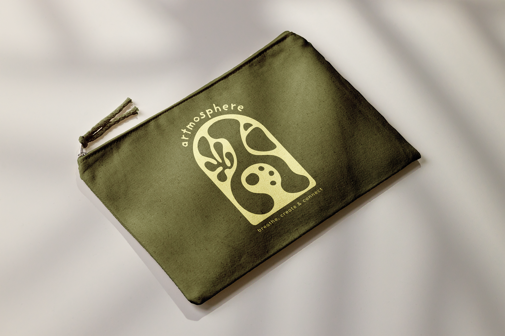
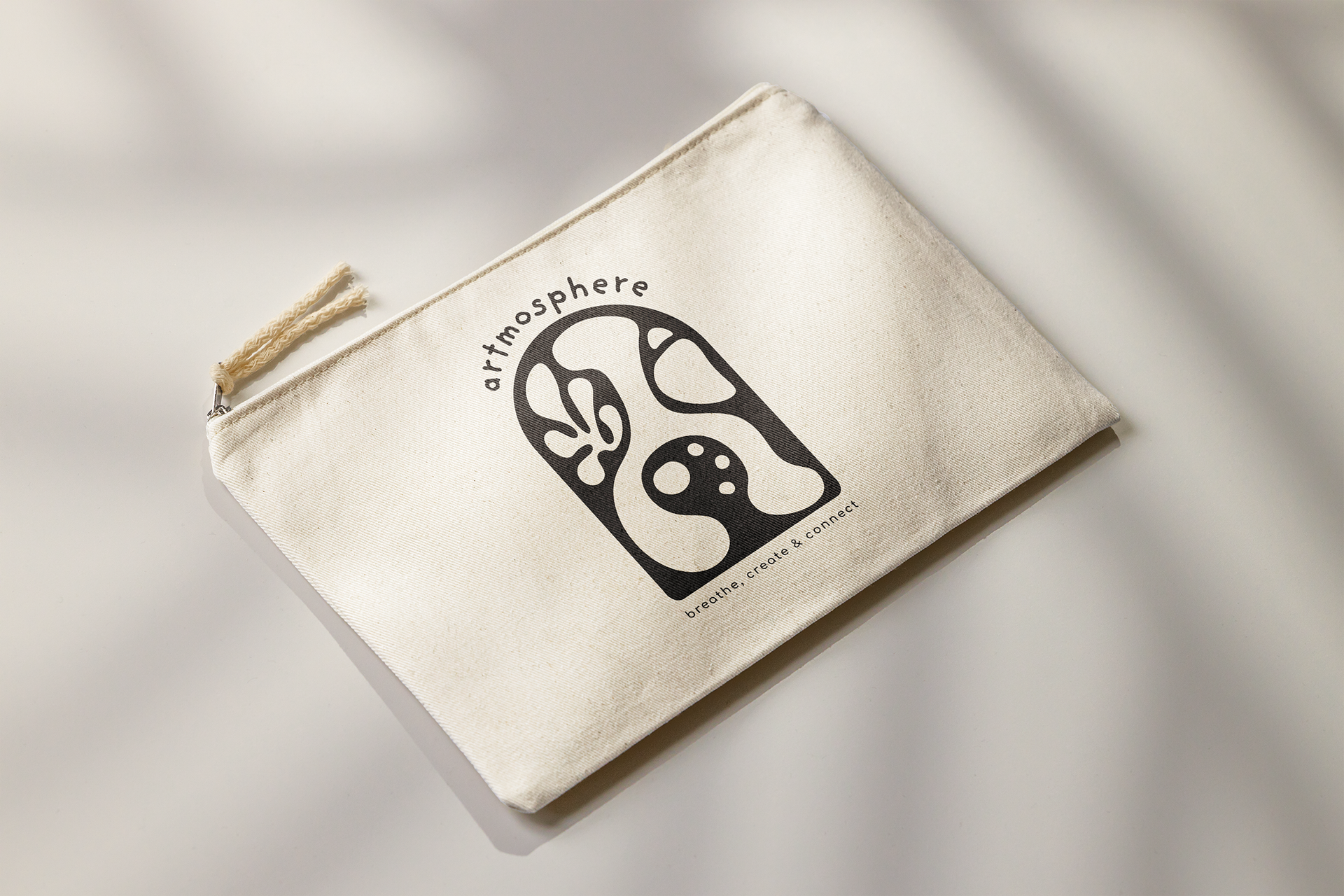
Artmosphere (2023)
Branding and advertising for a new friendship building experience.
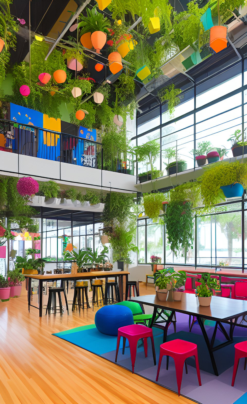
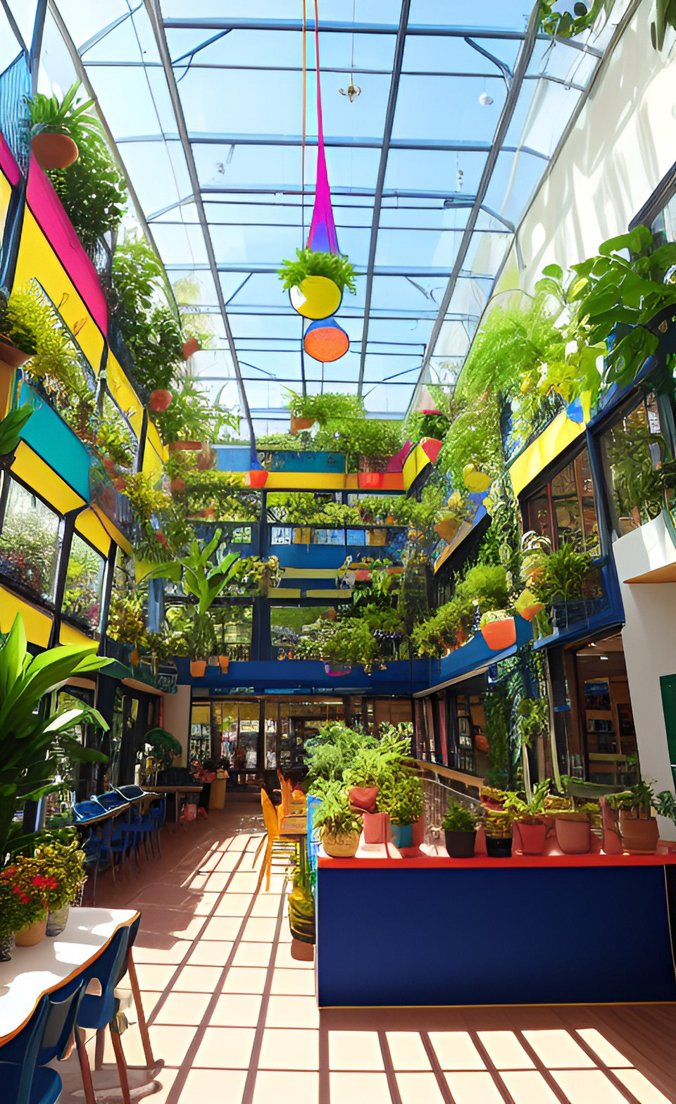
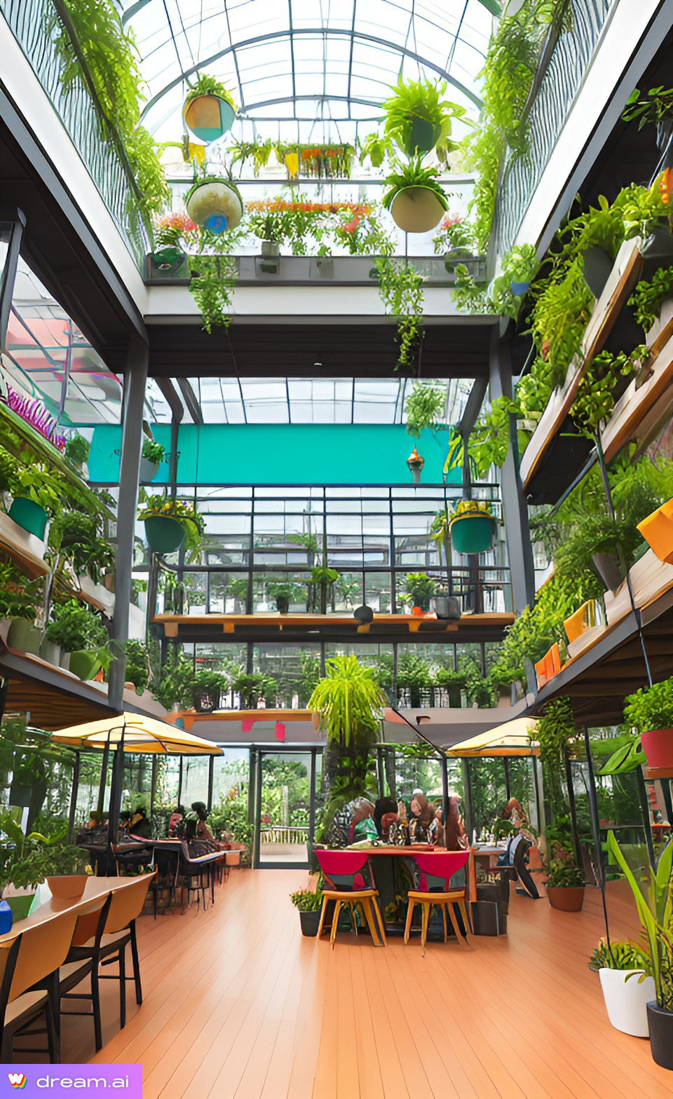
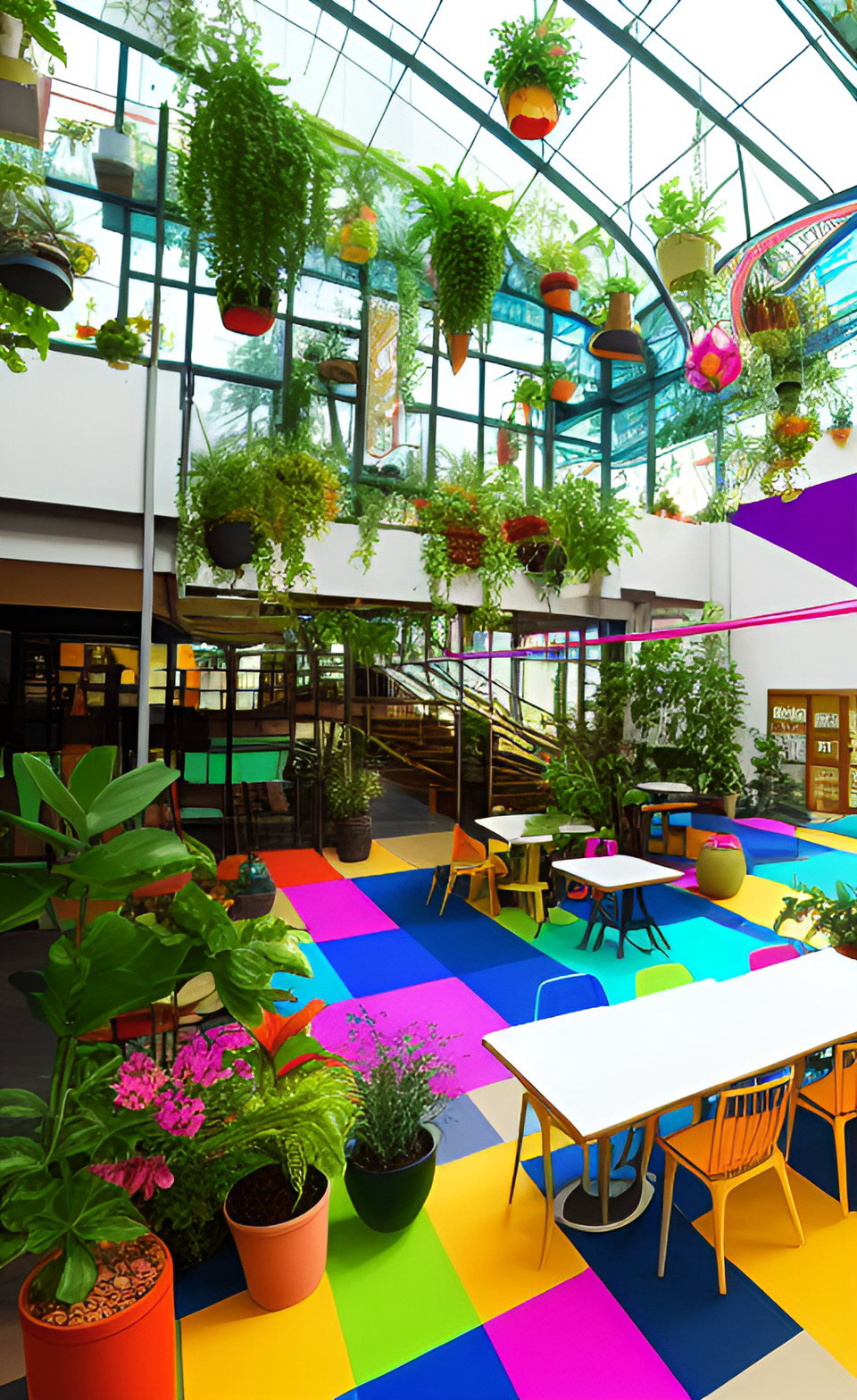
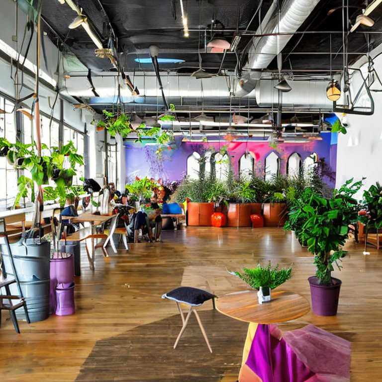
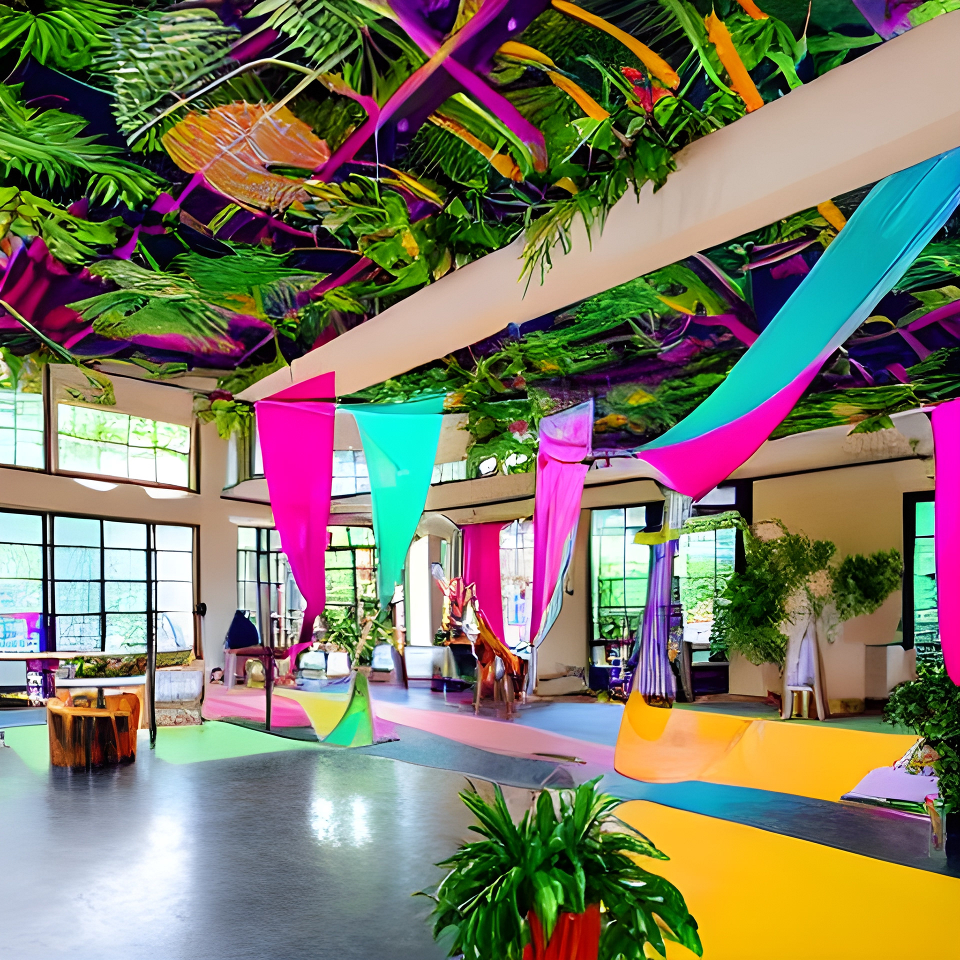
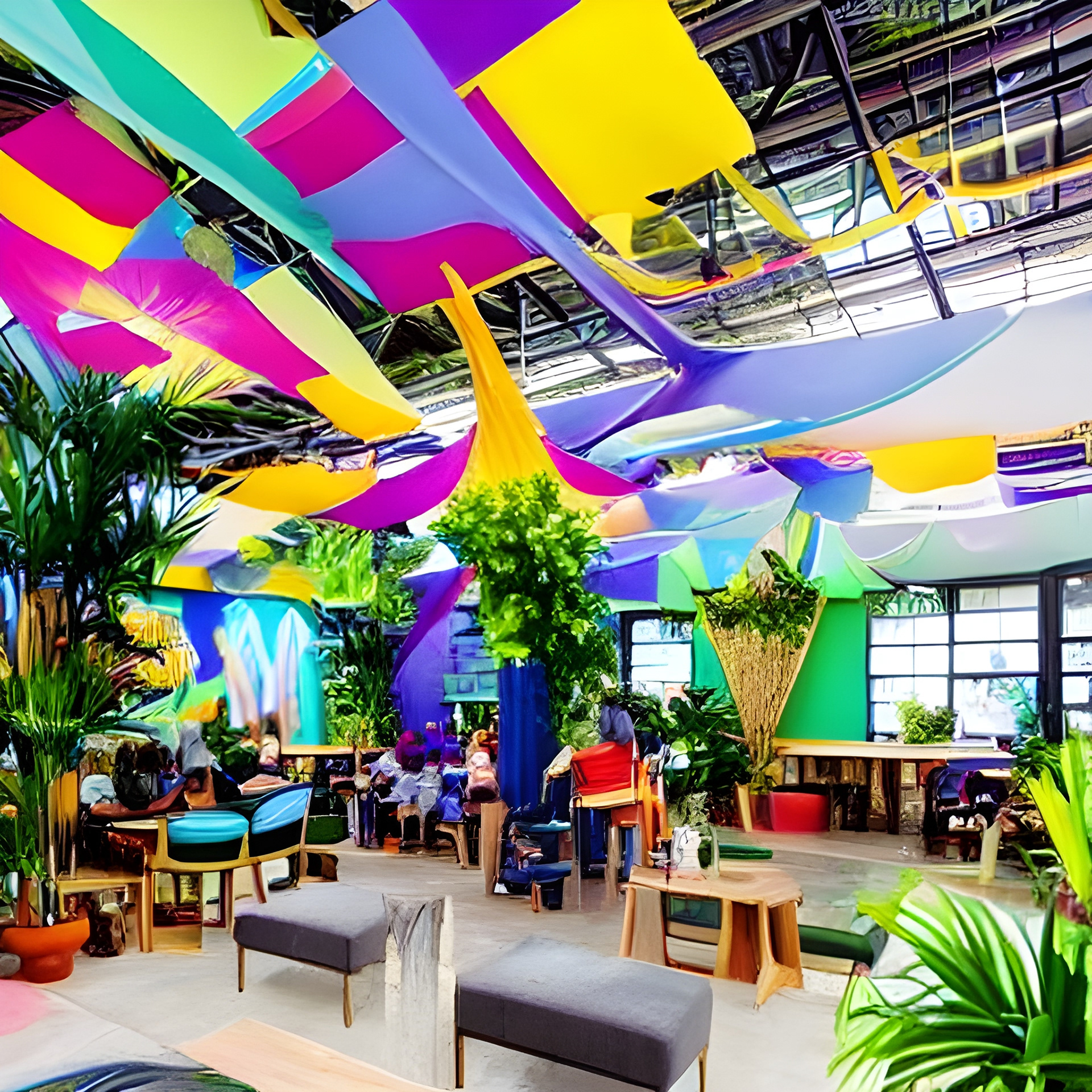
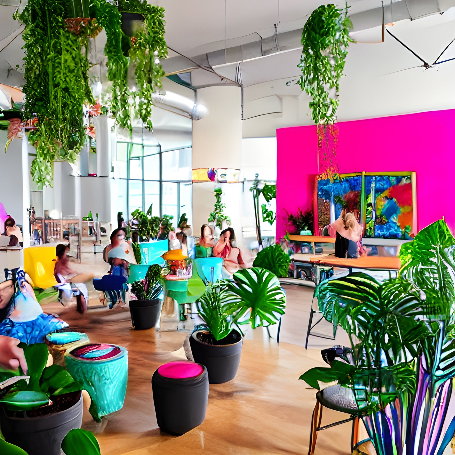
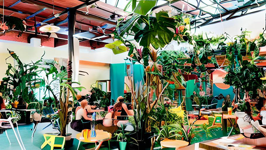
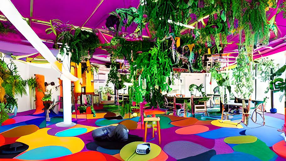
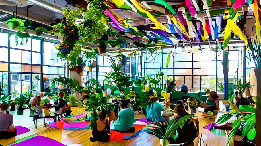
Artmosphere is an inclusive and innovative space designed for creative individuals and nature enthusiasts. It offers a harmonious blend of a café, art space, and yoga studio, surrounded by lush welcoming plants. The space emphasizes a patient, accepting, and nurturing ambiance while maintaining a zero-tolerance policy for negativity.
Space Design (AI generated)
The venue provides various tools and equipment for flow artists and encourages artists to freely express themselves and exchange their works with others. During the day, Artmosphere fosters a calm atmosphere, while at night, it transforms into a vibrant hub with live music and DJ performances. The café and classes generate profits that are reinvested into the space, ensuring its continuous evolution.
Artmosphere aims to be a borderless and wall-less environment, promoting communal inspiration and facilitating connections among like-minded individuals. Whether you’re an illustrator, textile artist, aerialist, or any creative person, the café at Artmosphere welcomes you as a safe haven for artistic expression.
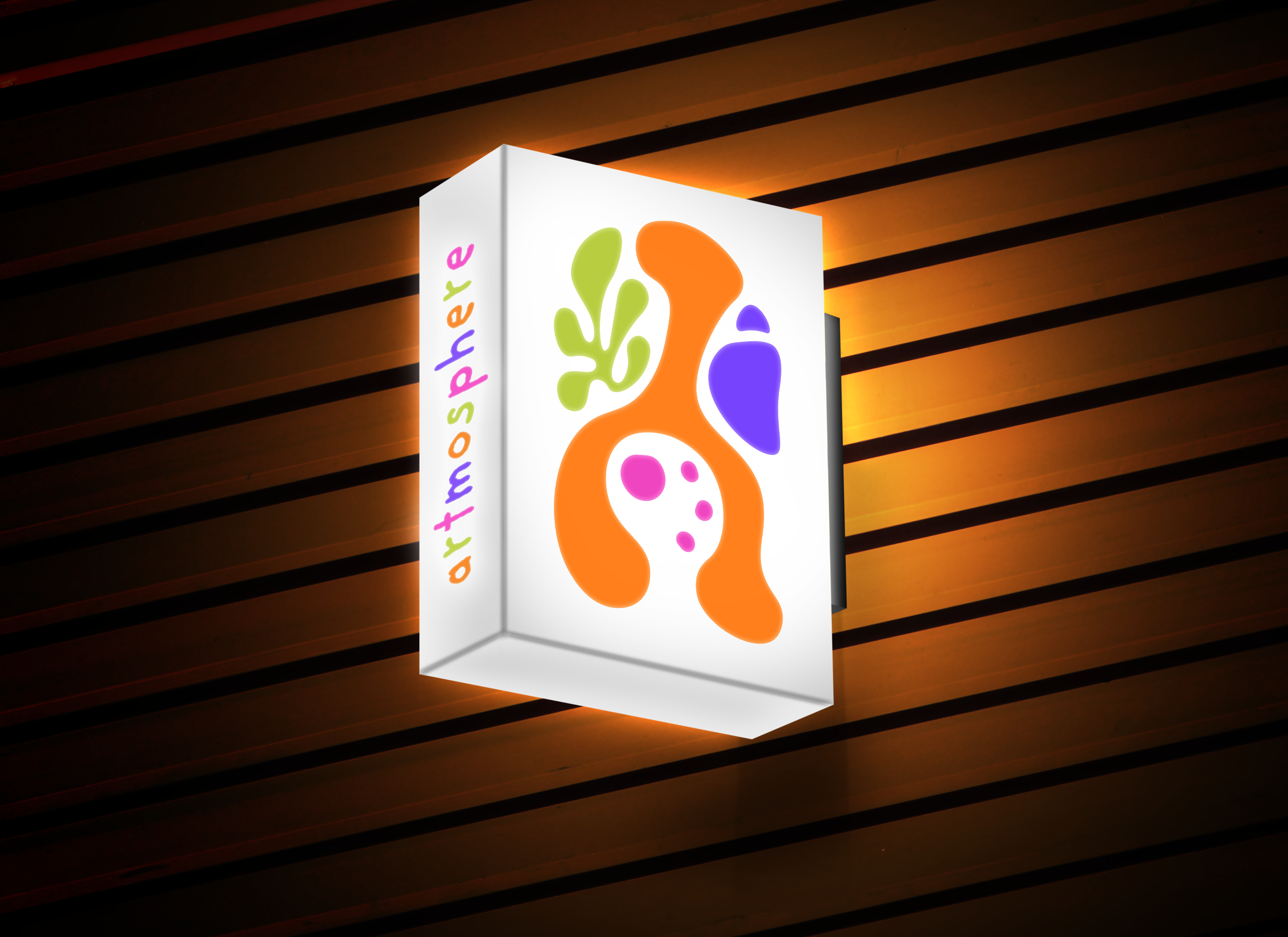
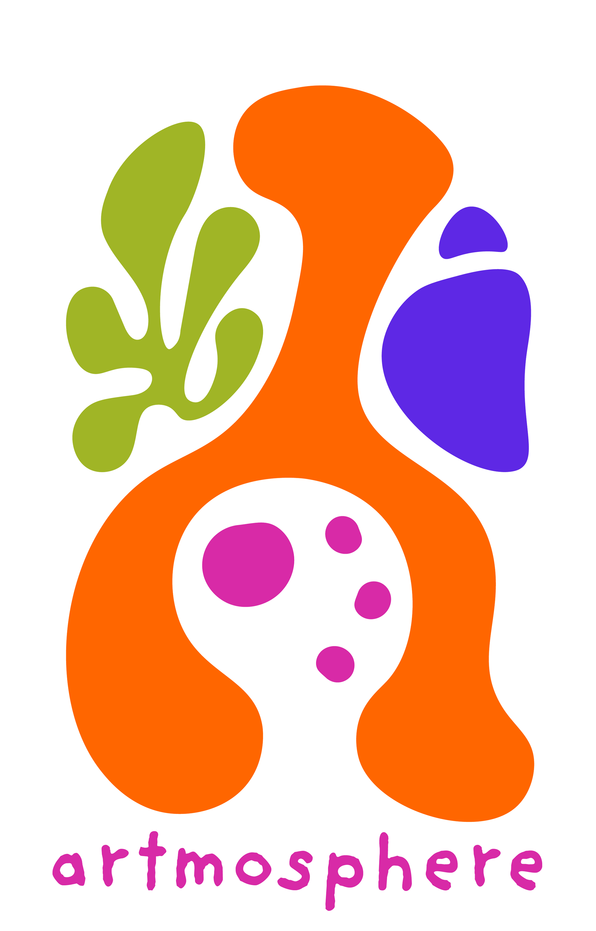
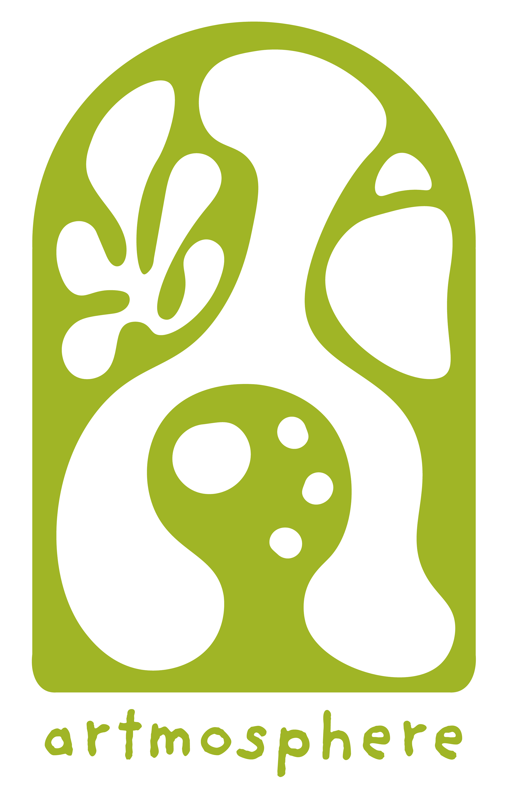
Logo Design
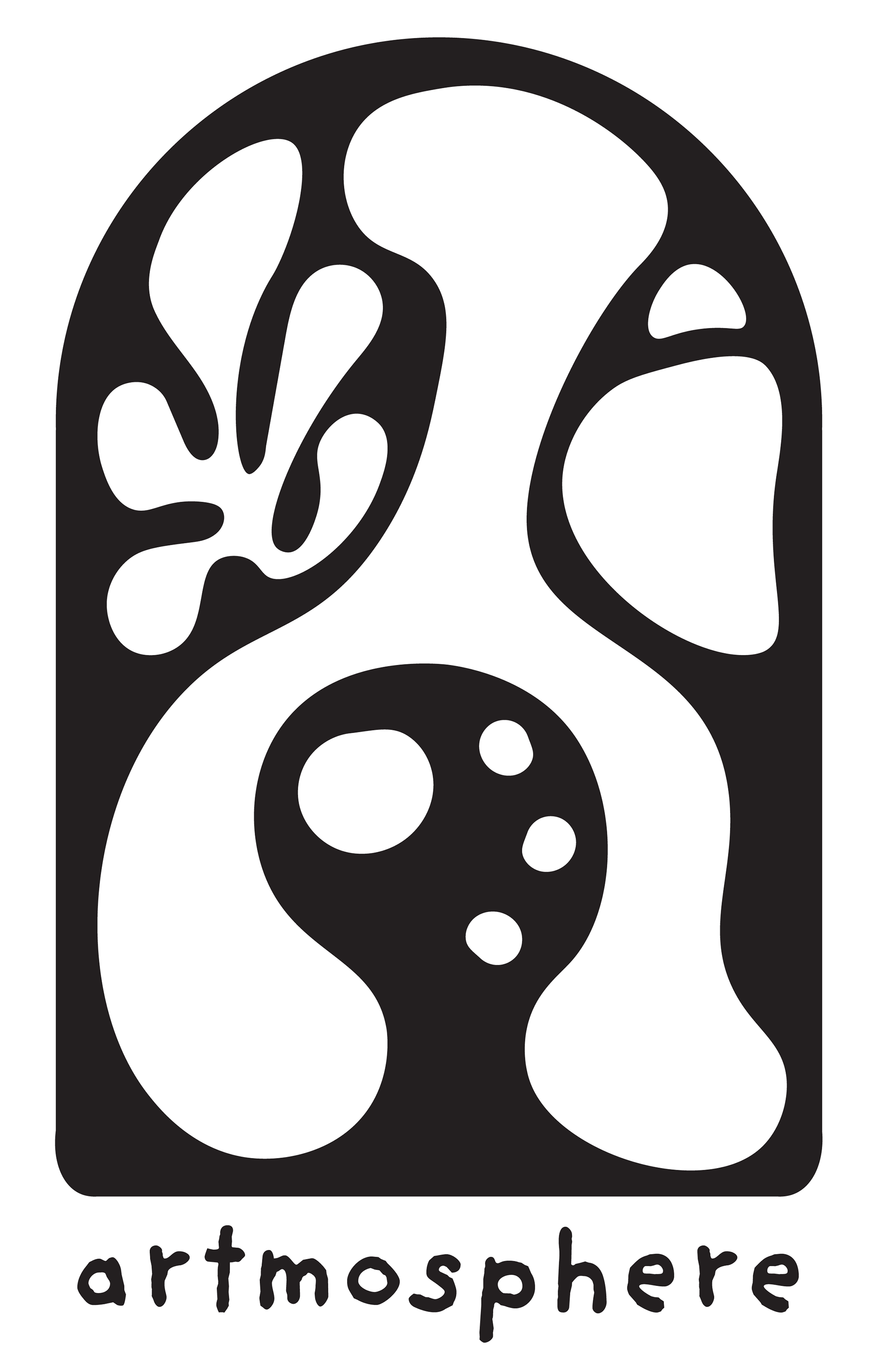
Logotype

Logo Ideation


Logo Variation
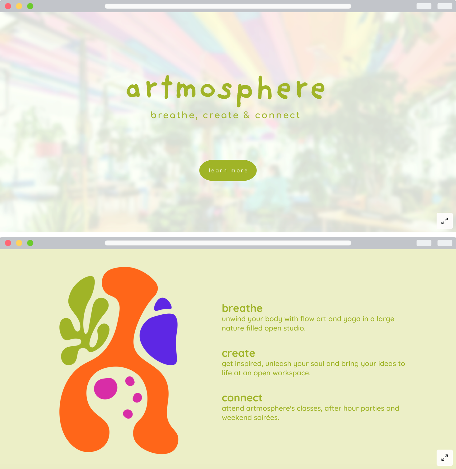
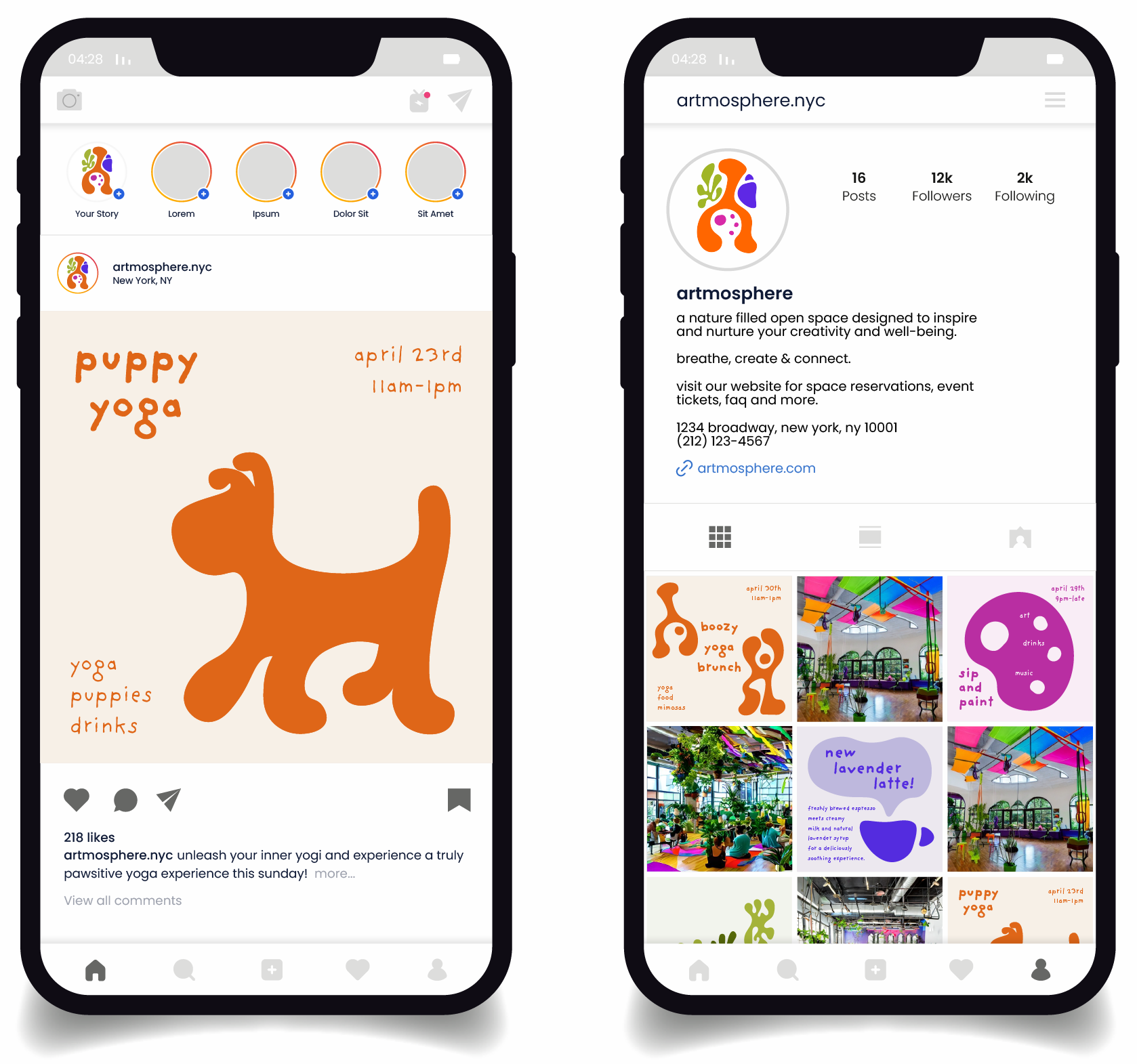
Web & Social
Merch Design
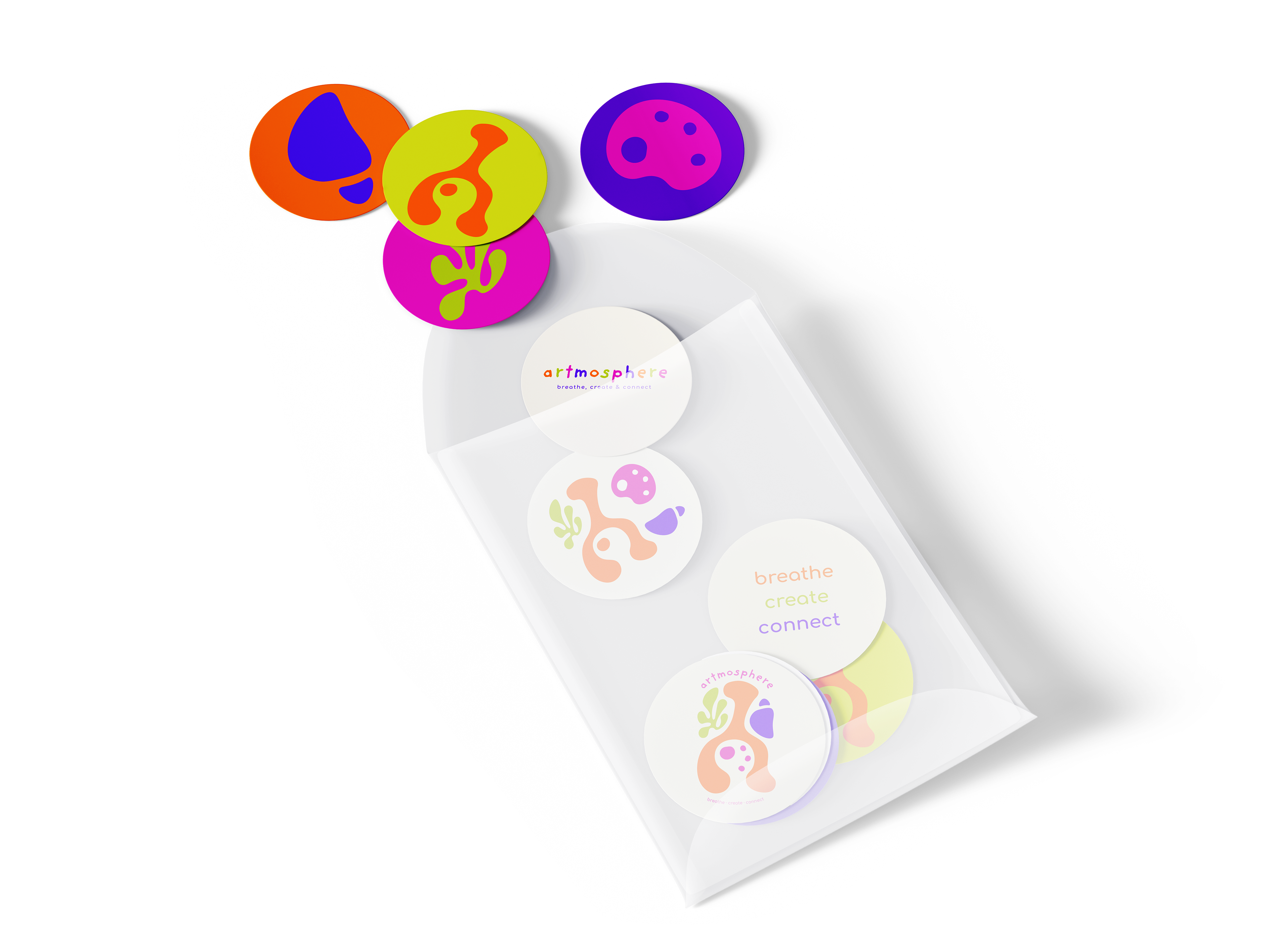
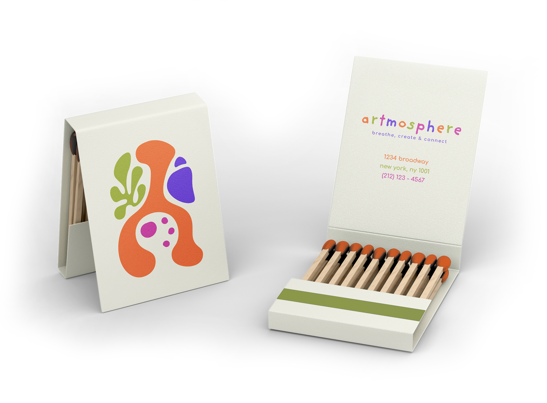
Stickers and Matchbooks
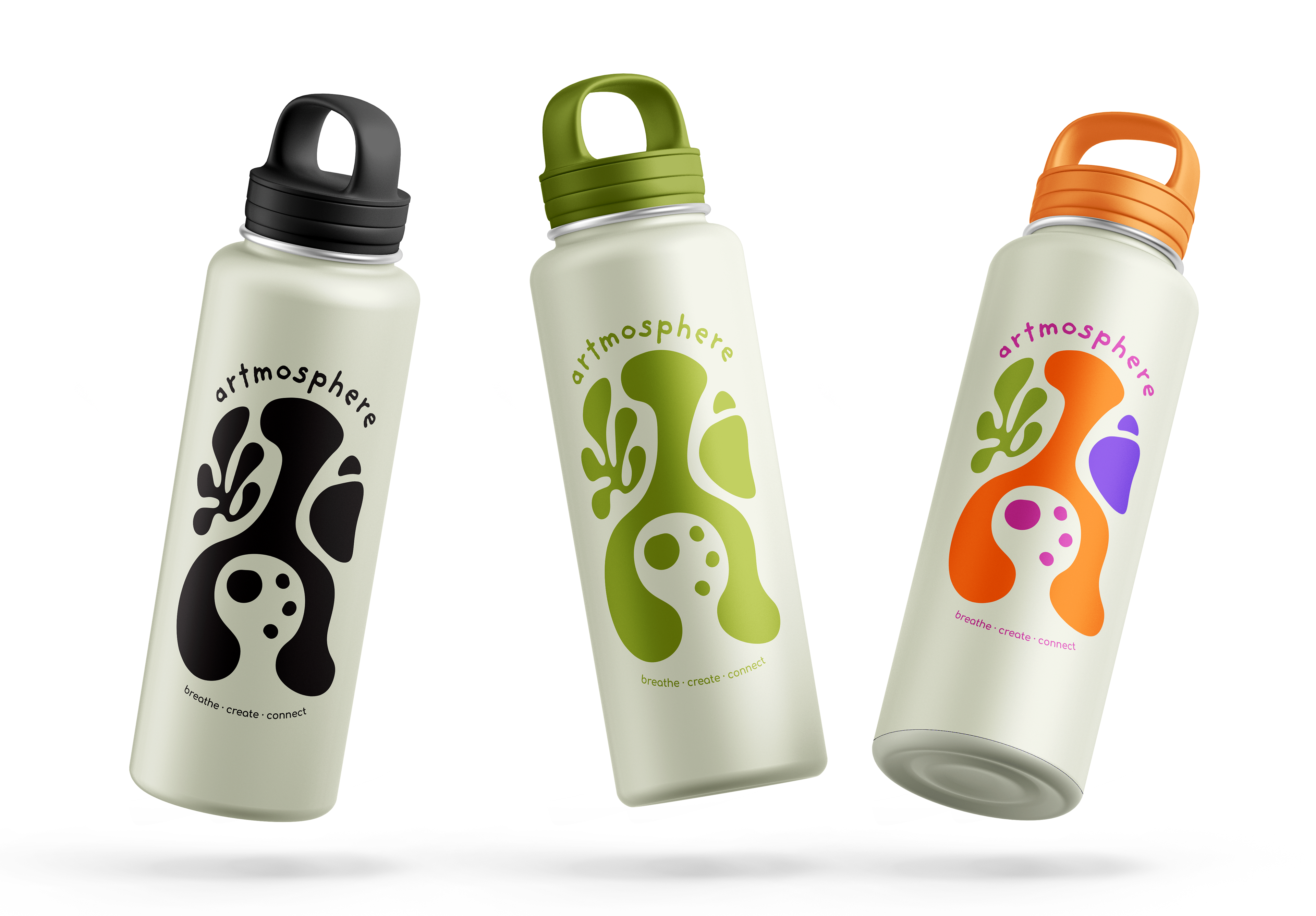
Refillable Water Bottles
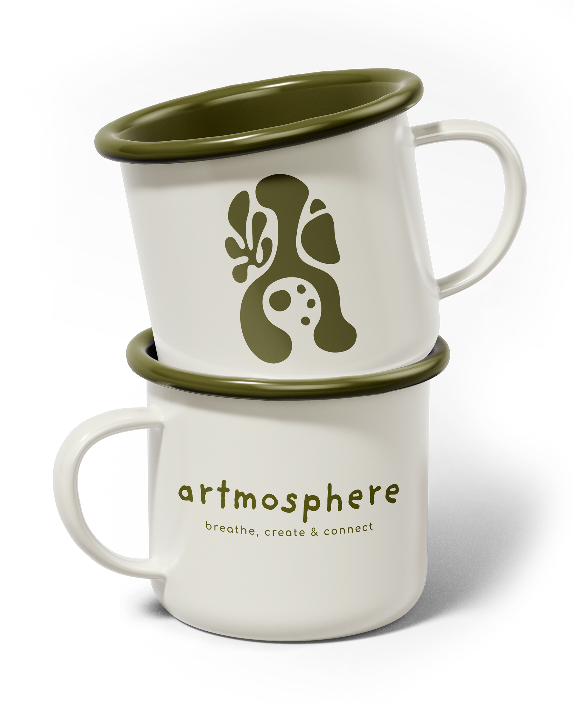
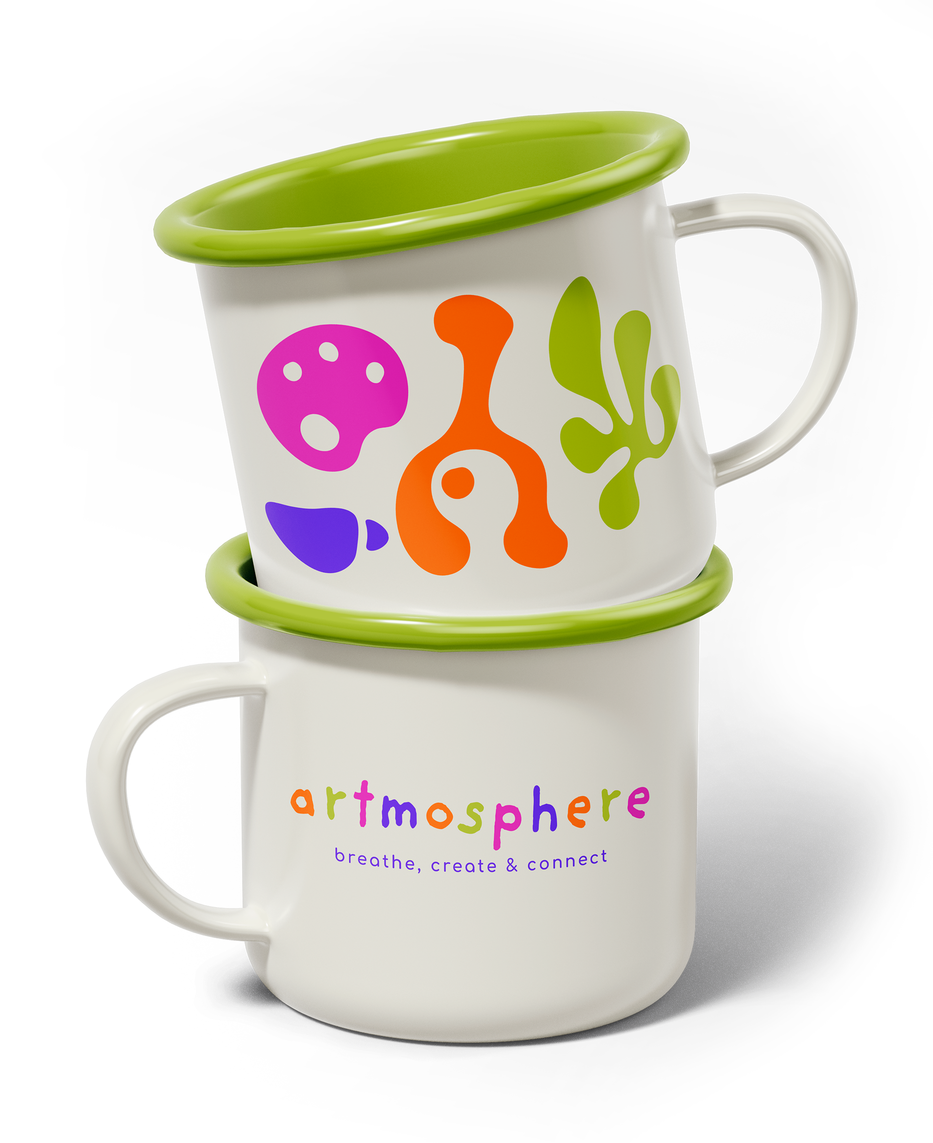
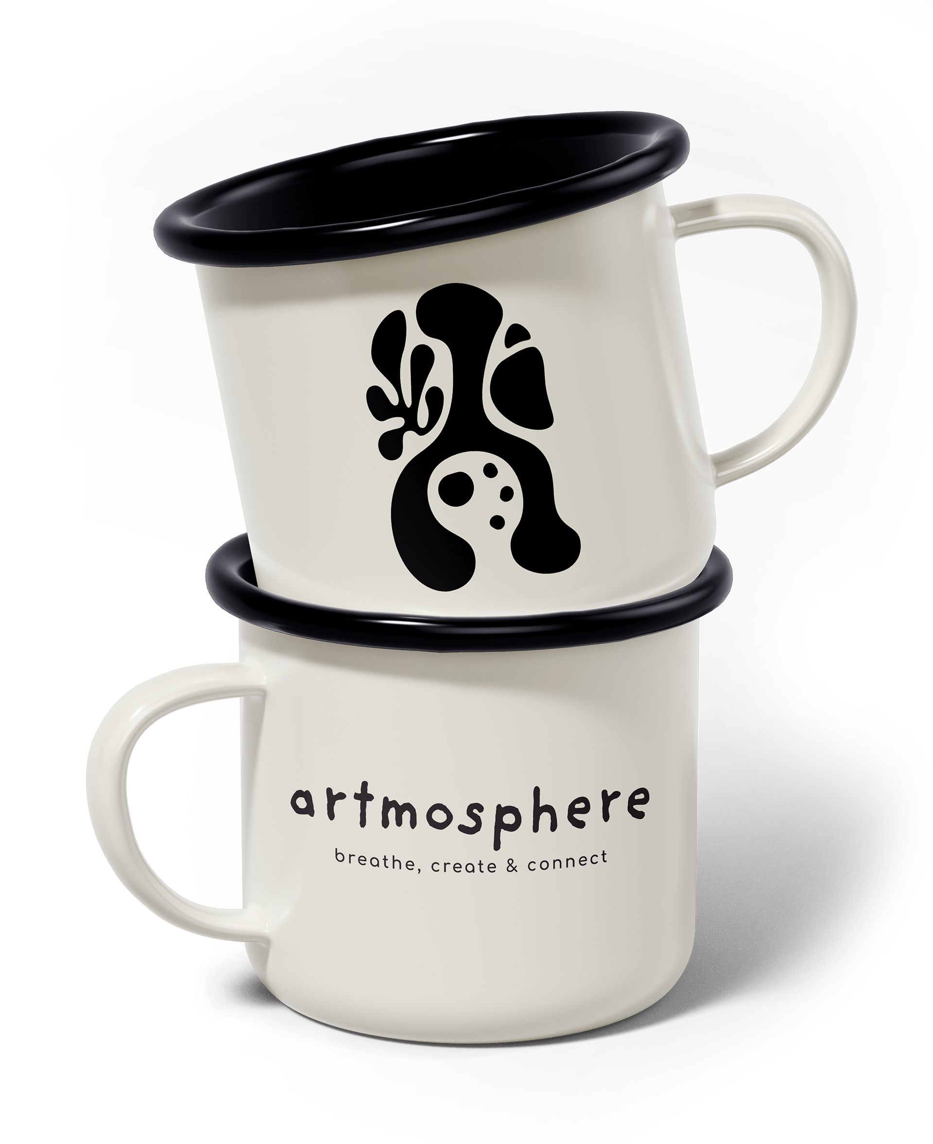
Mugs
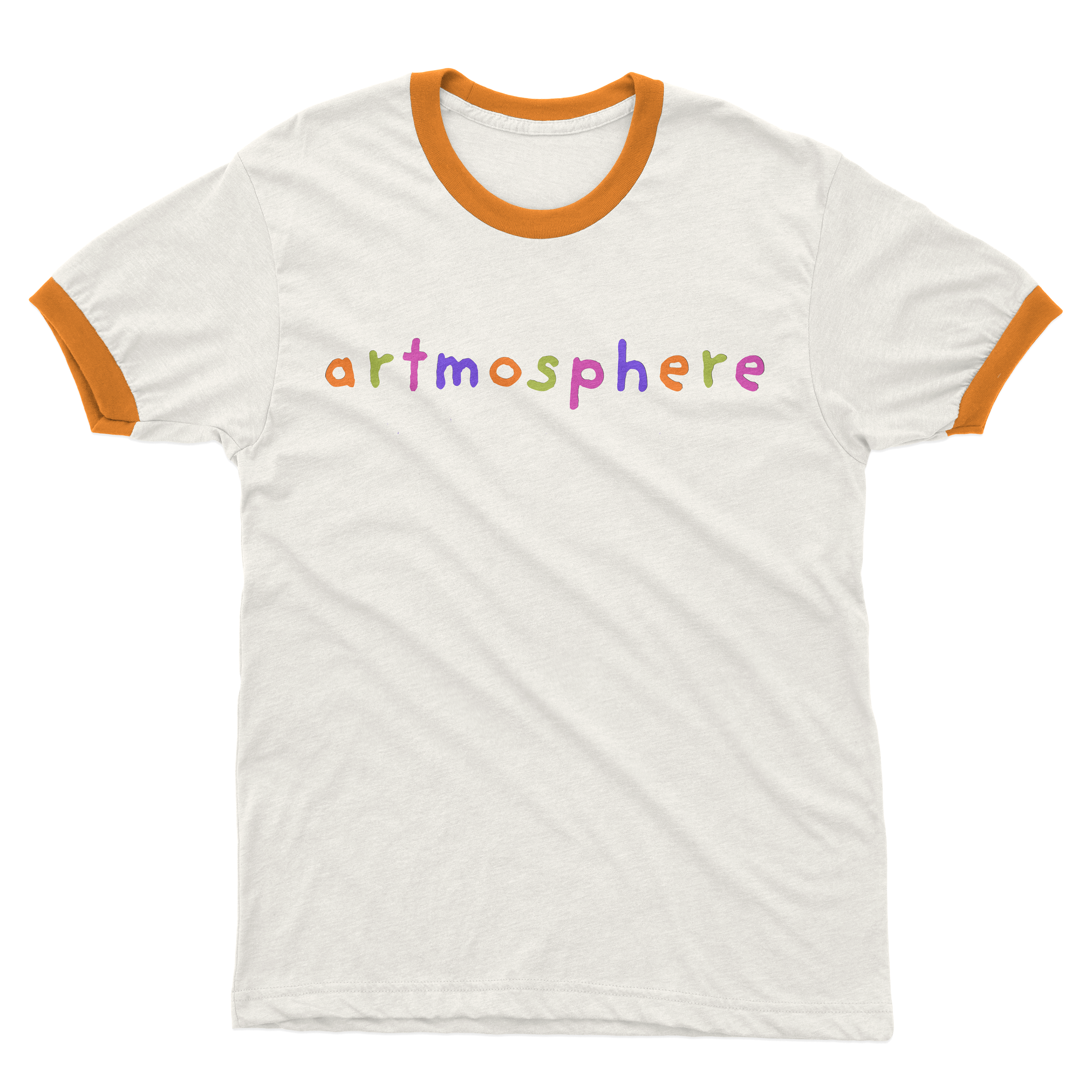
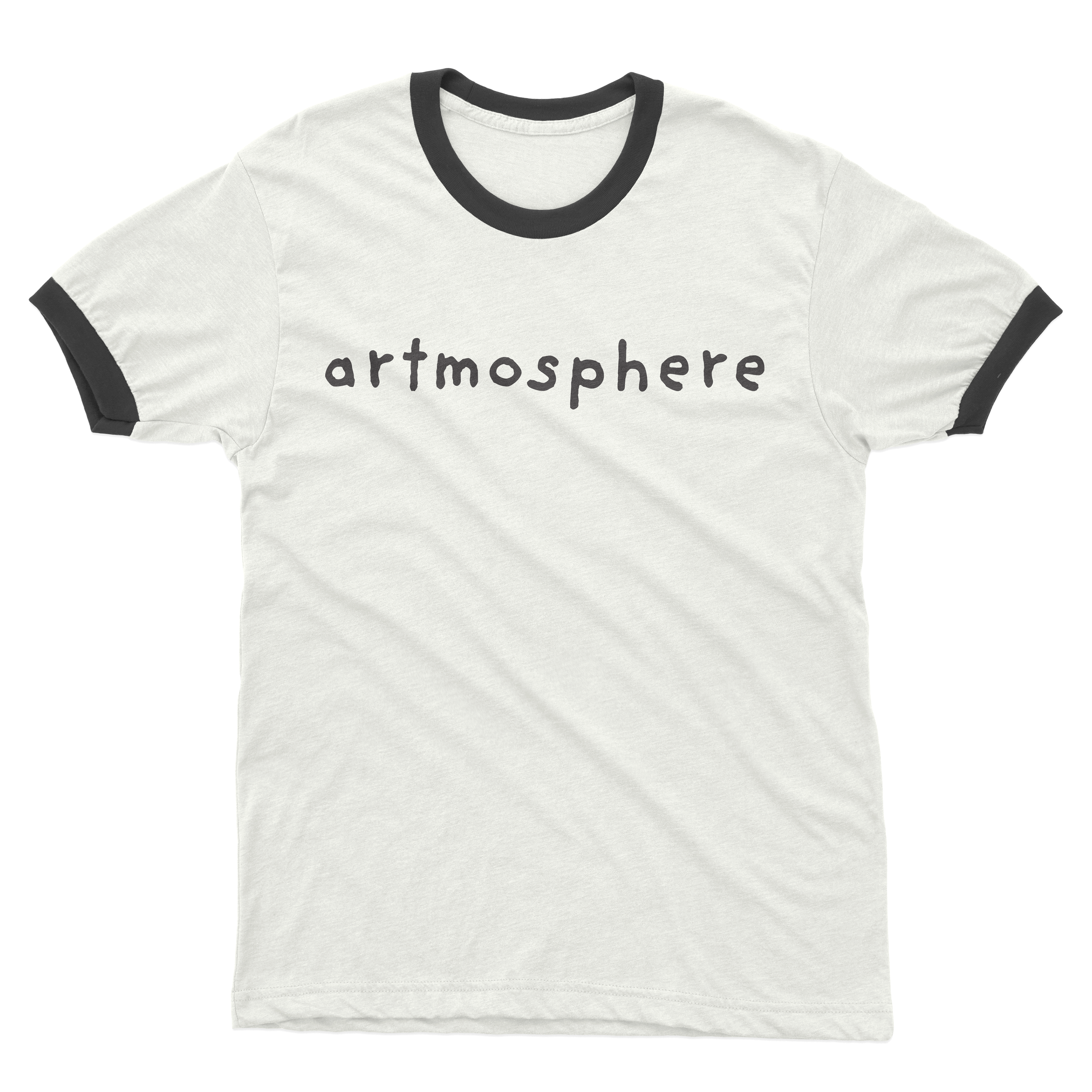
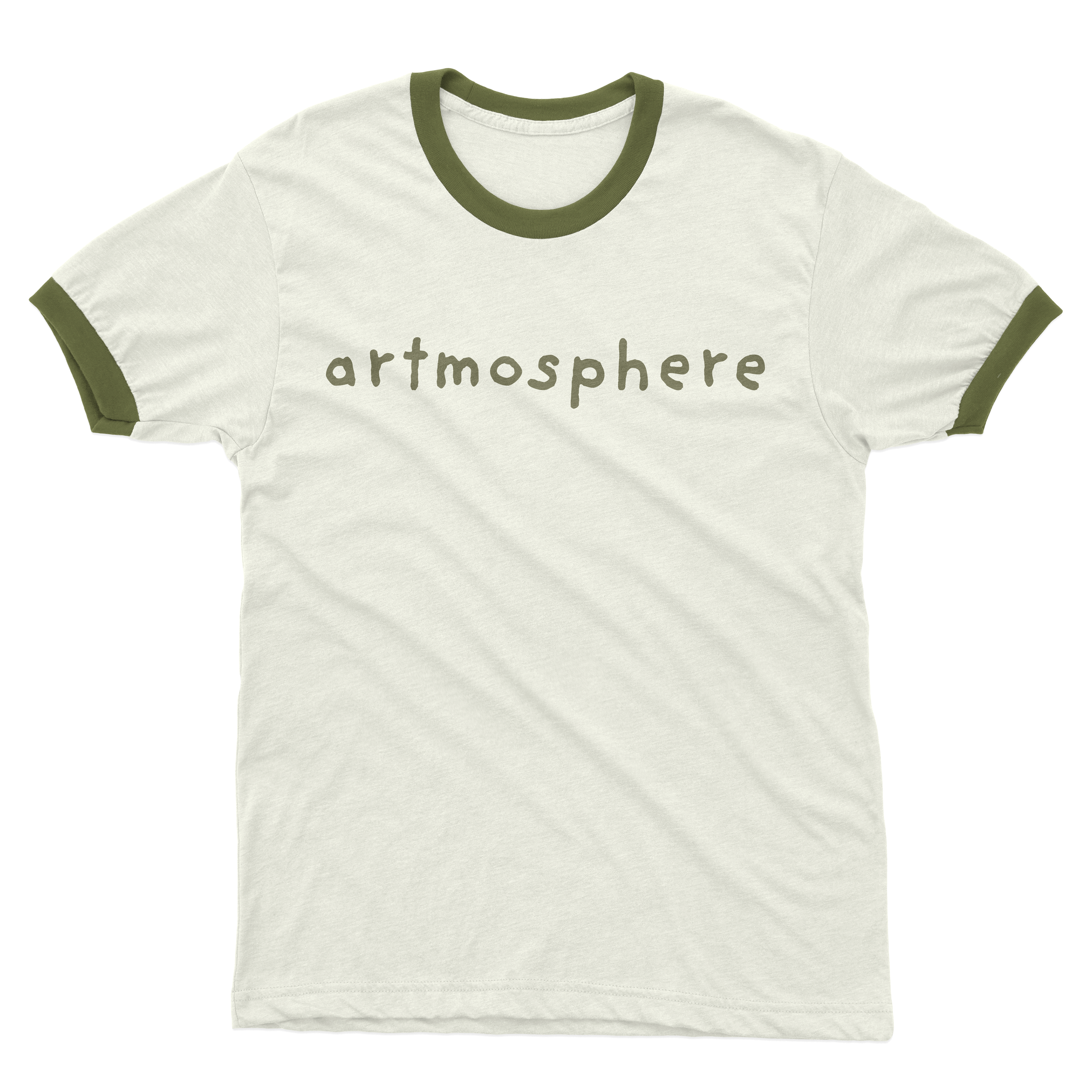
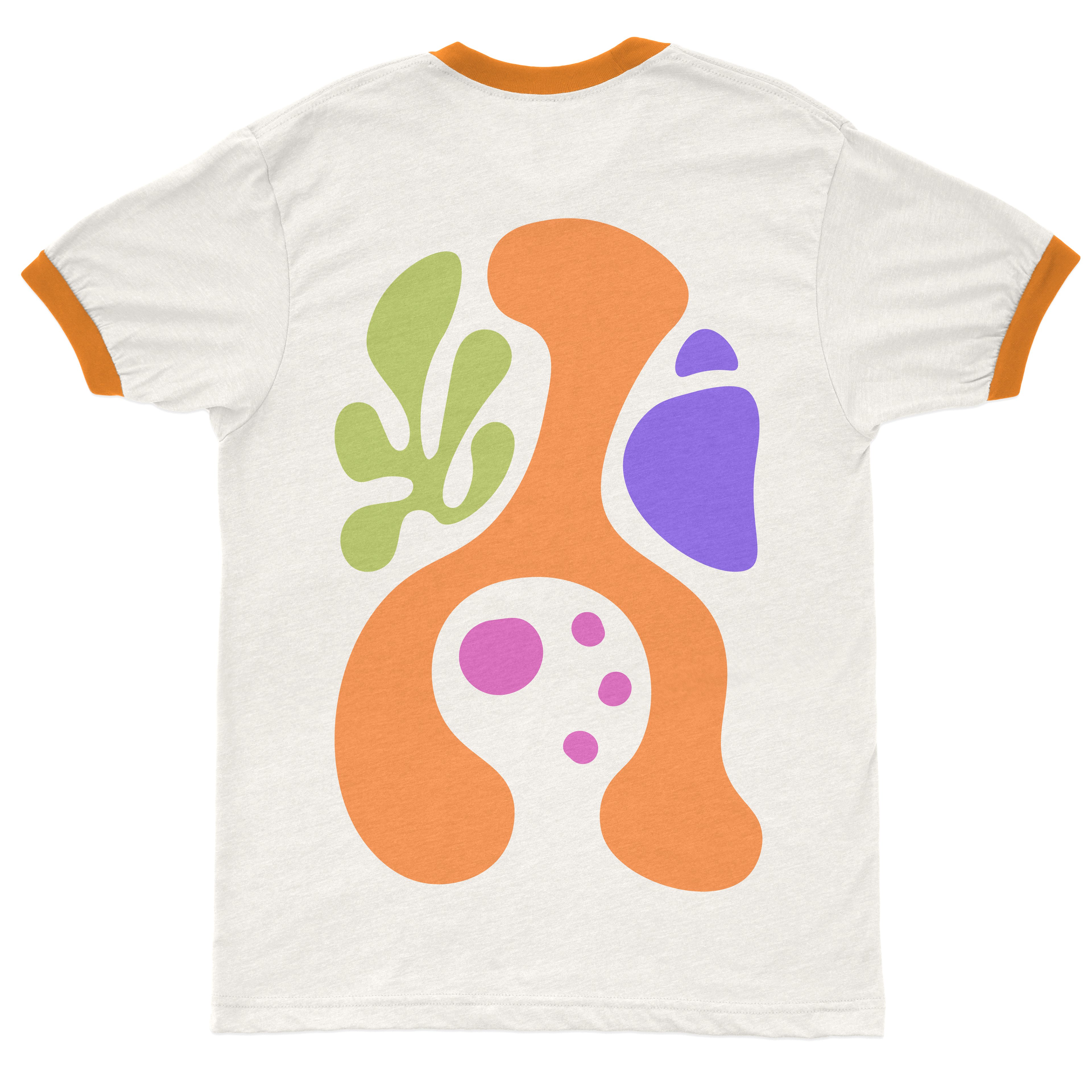
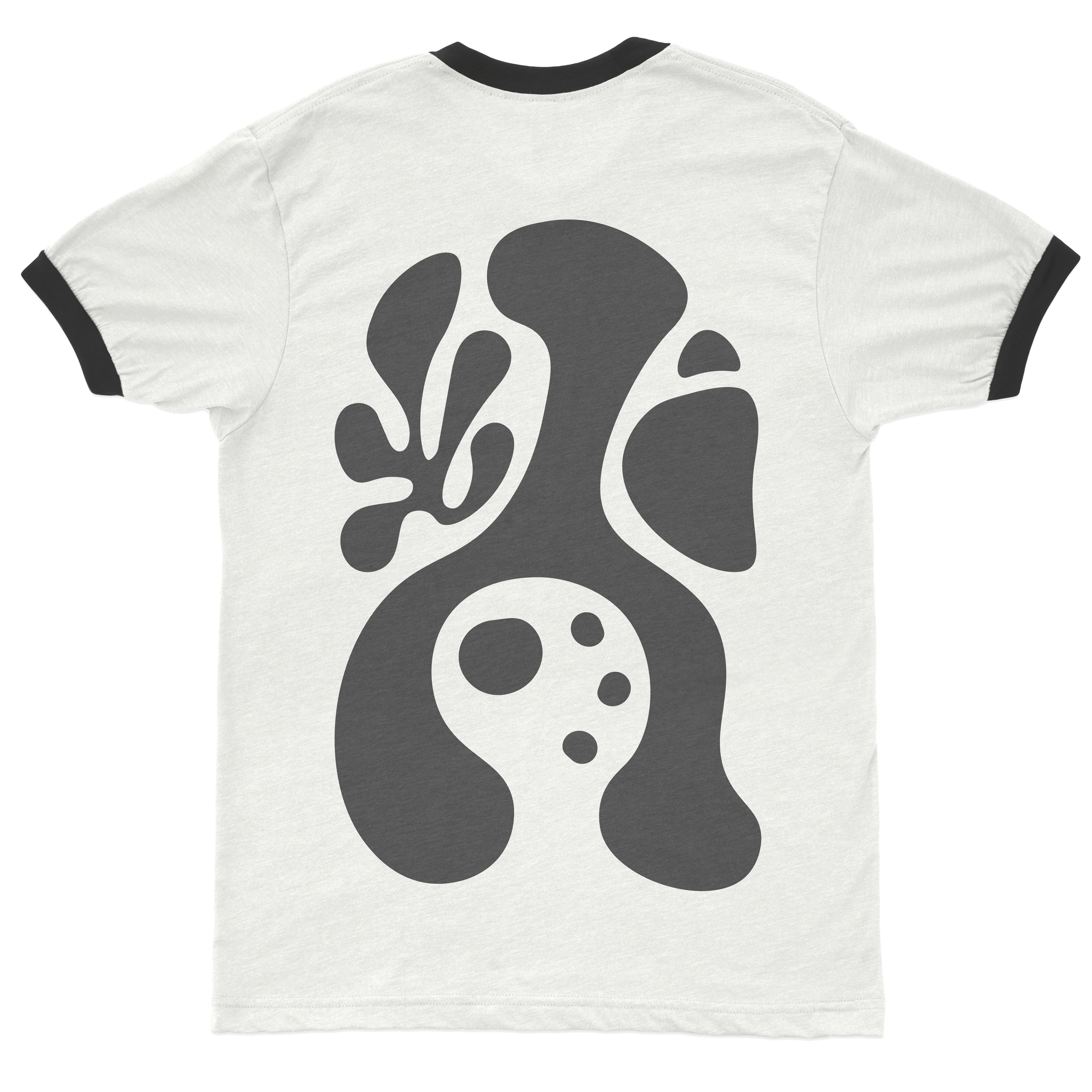
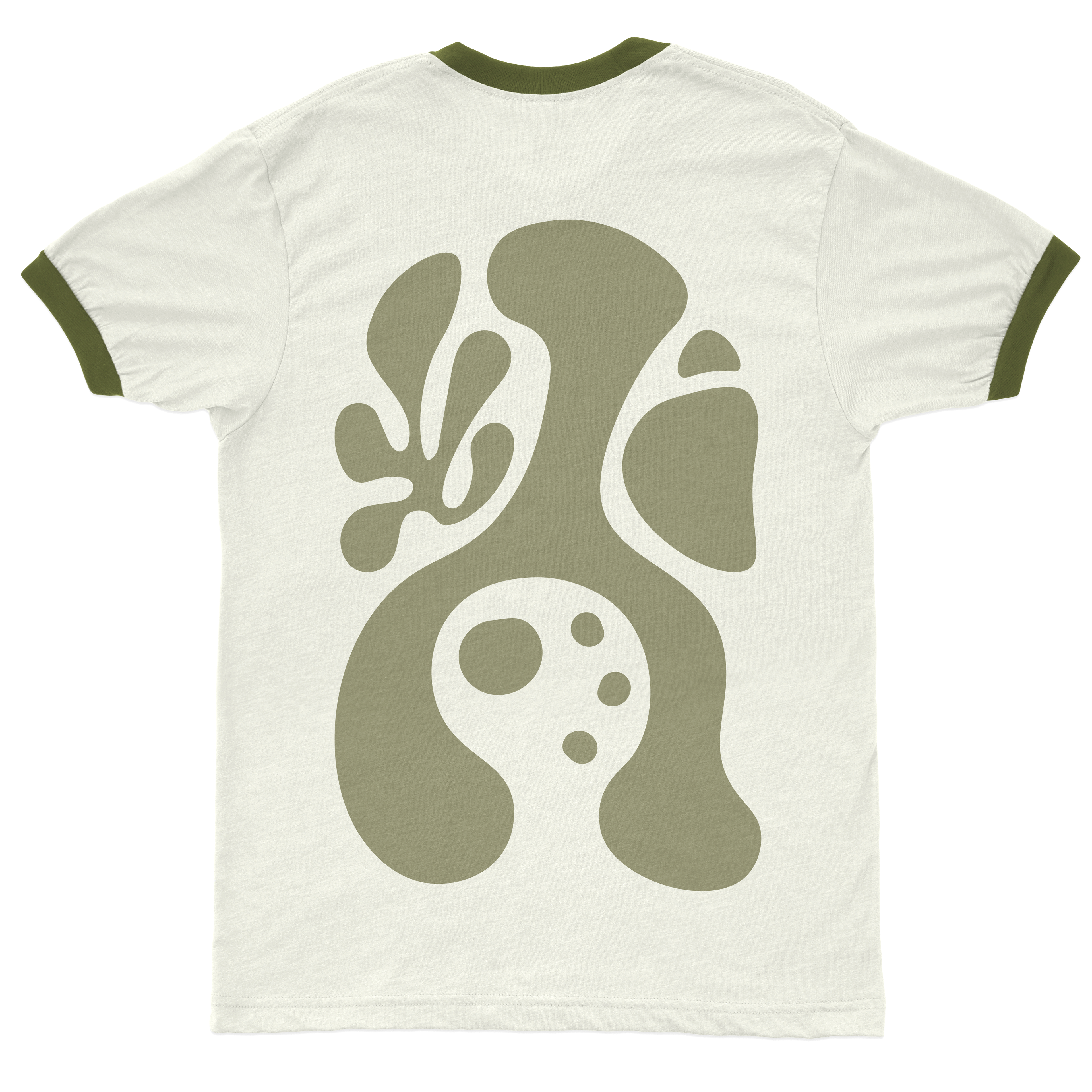
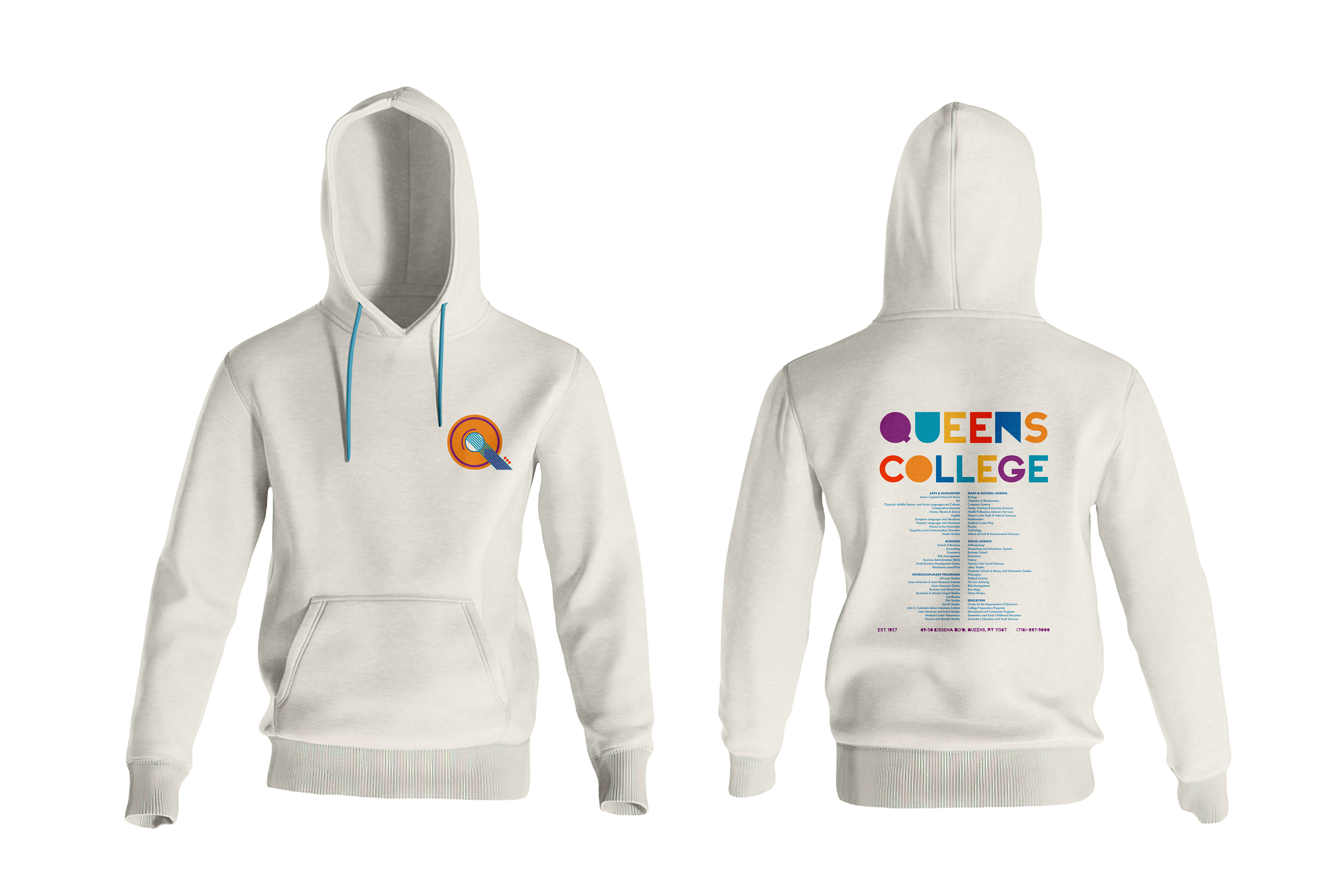
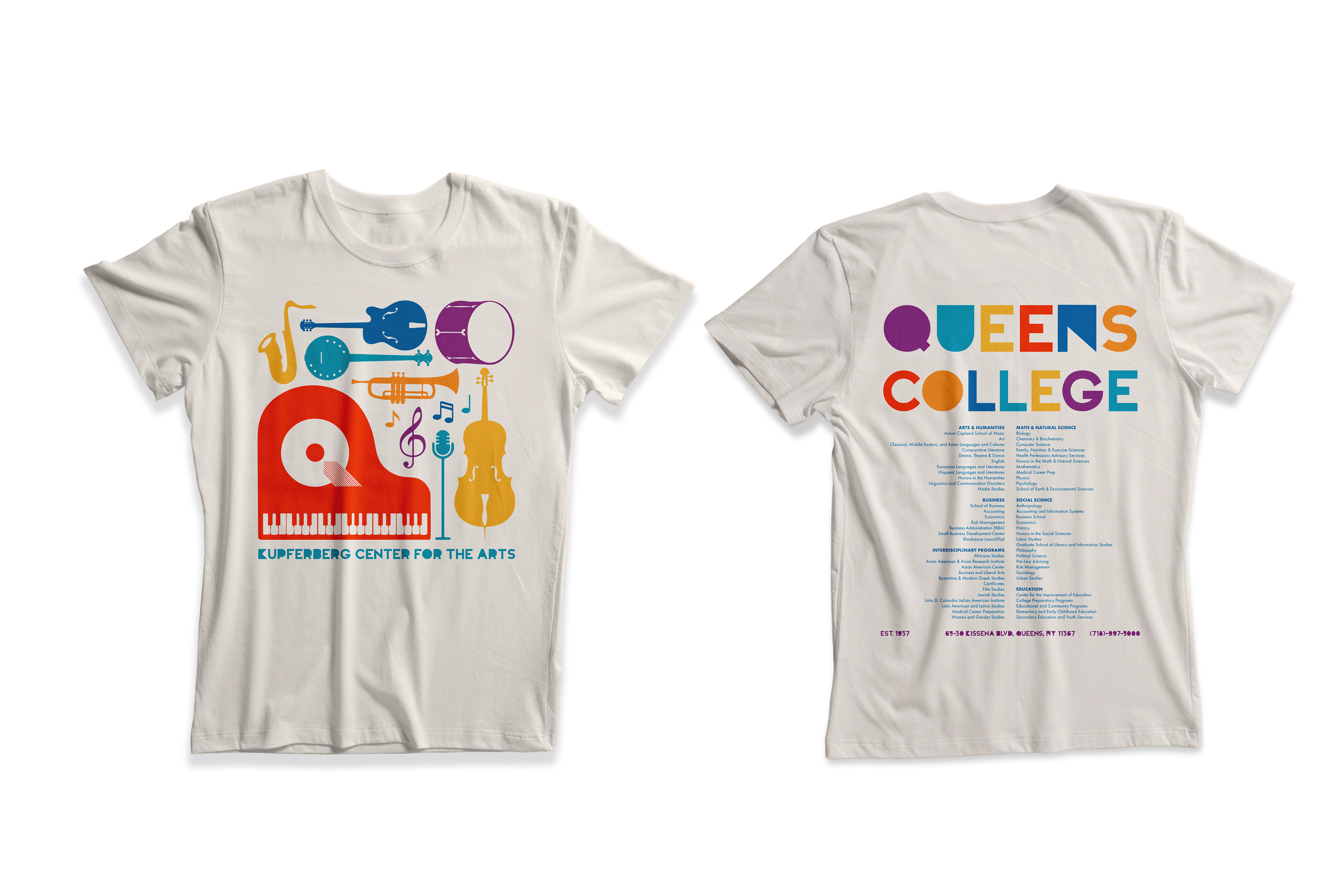
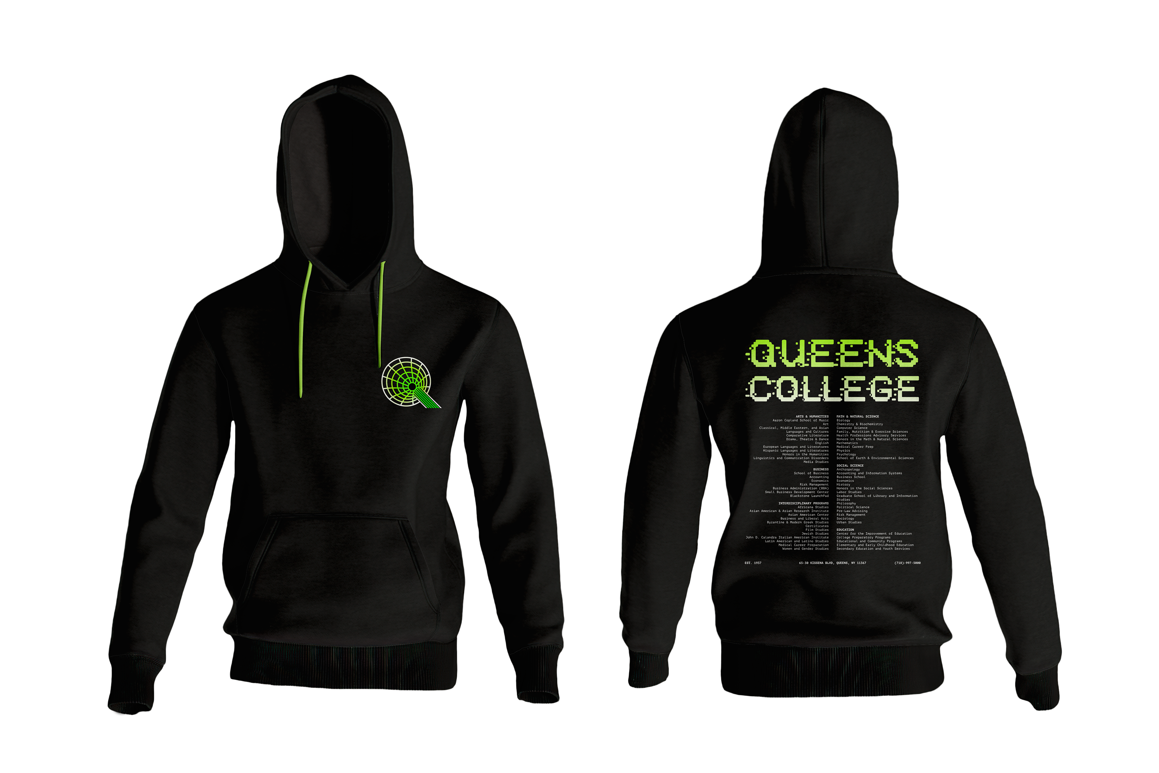
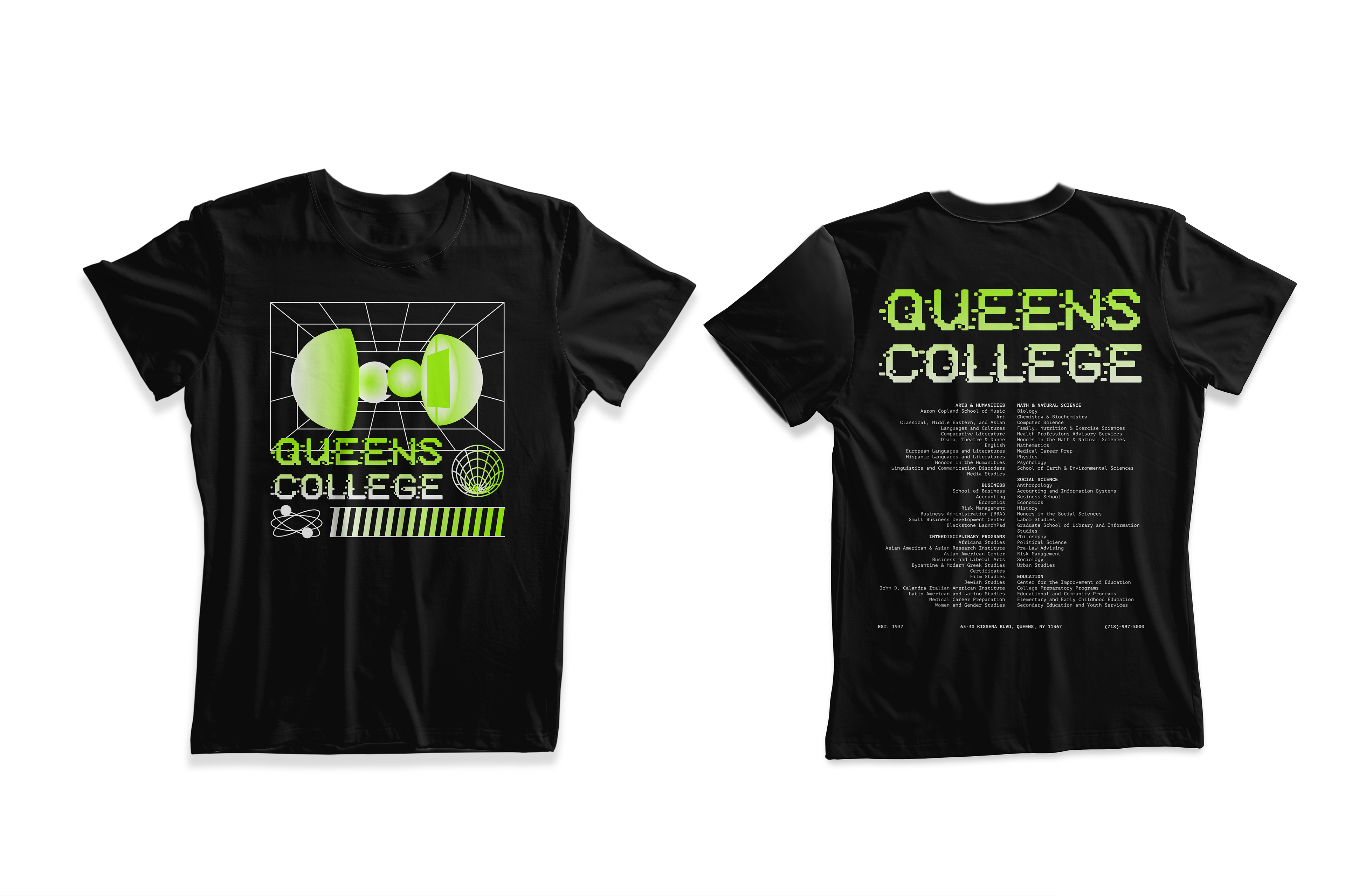
T-Shirts
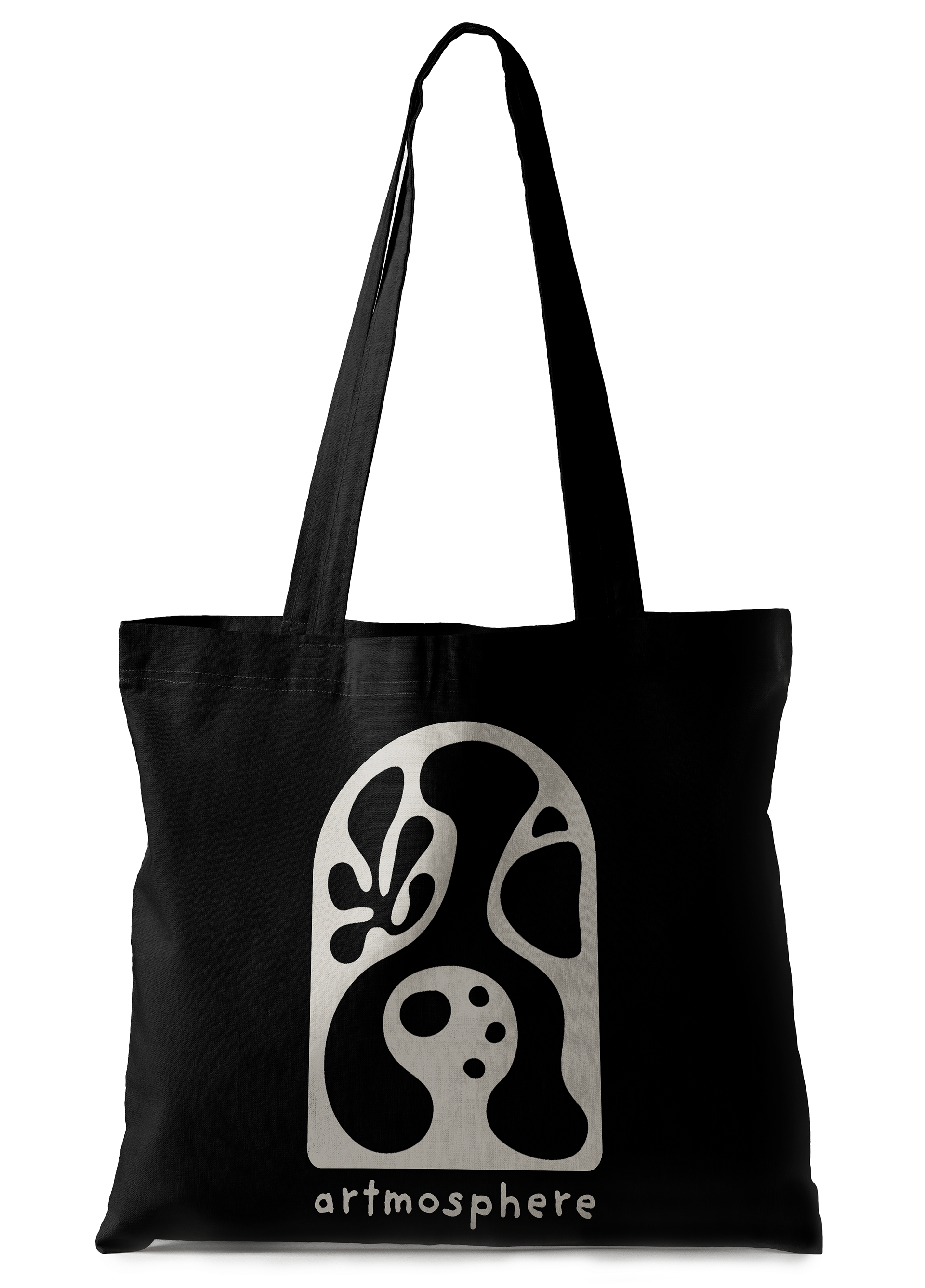
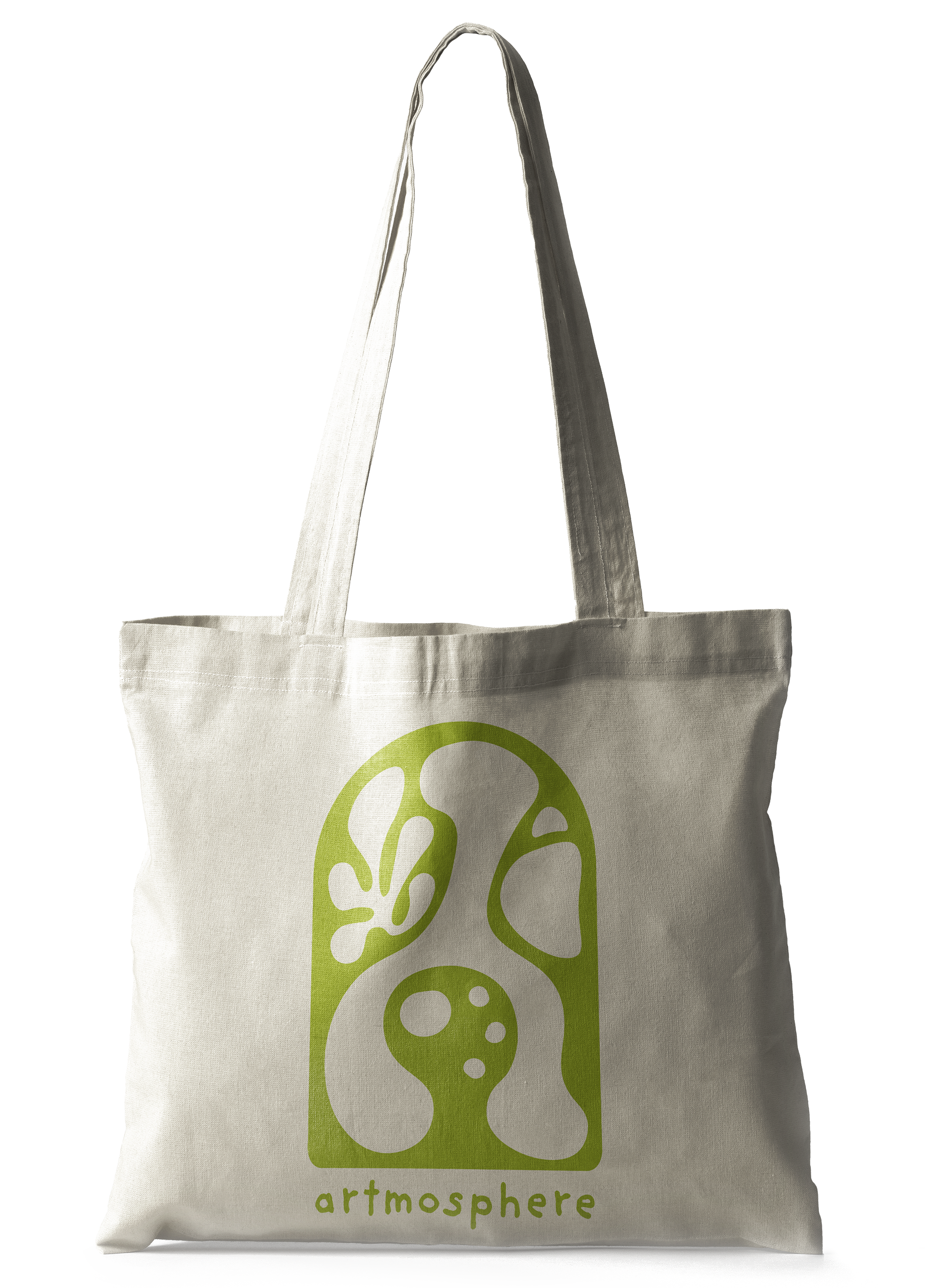
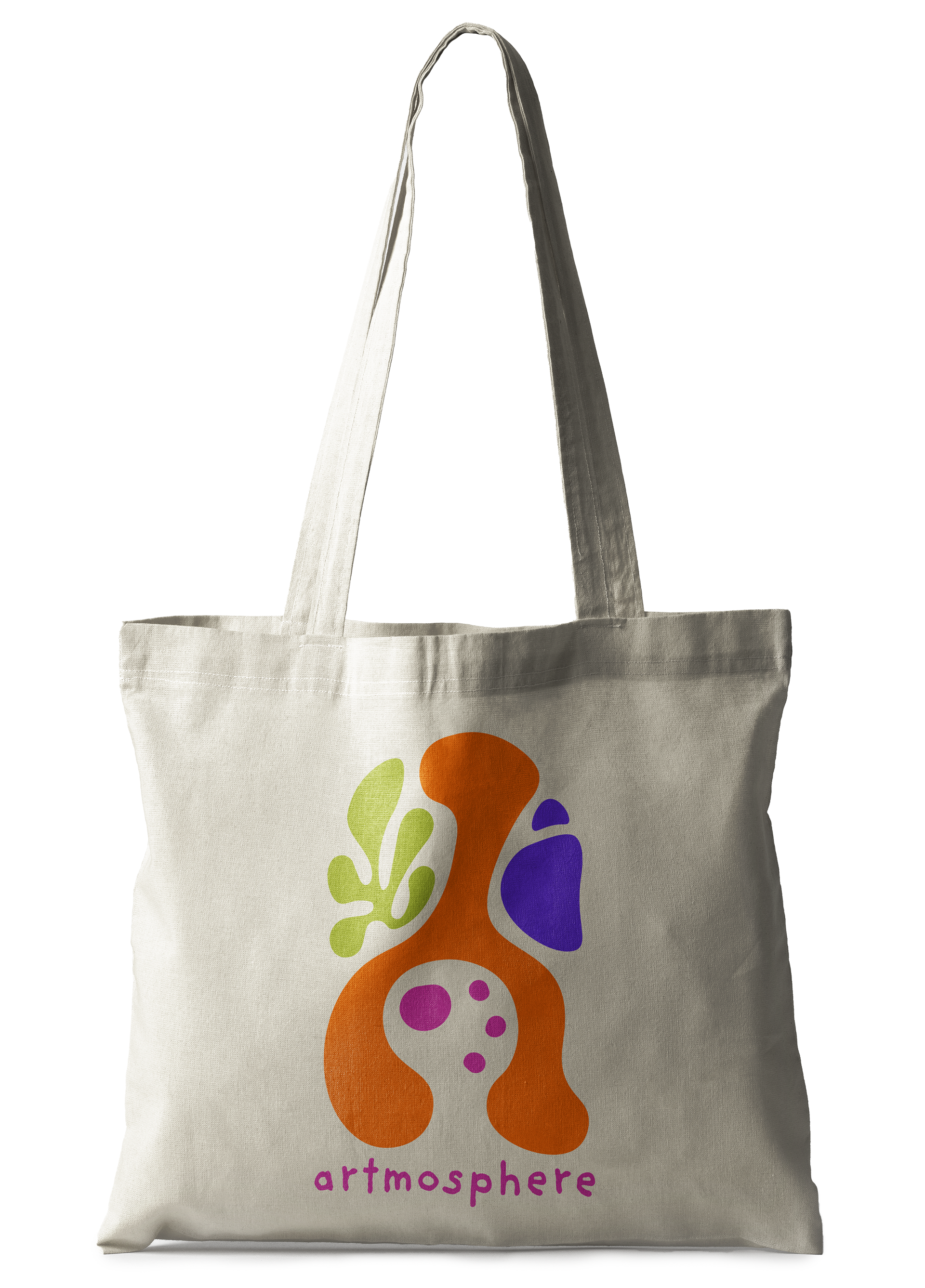
Large Wide Canvas Tote Bags
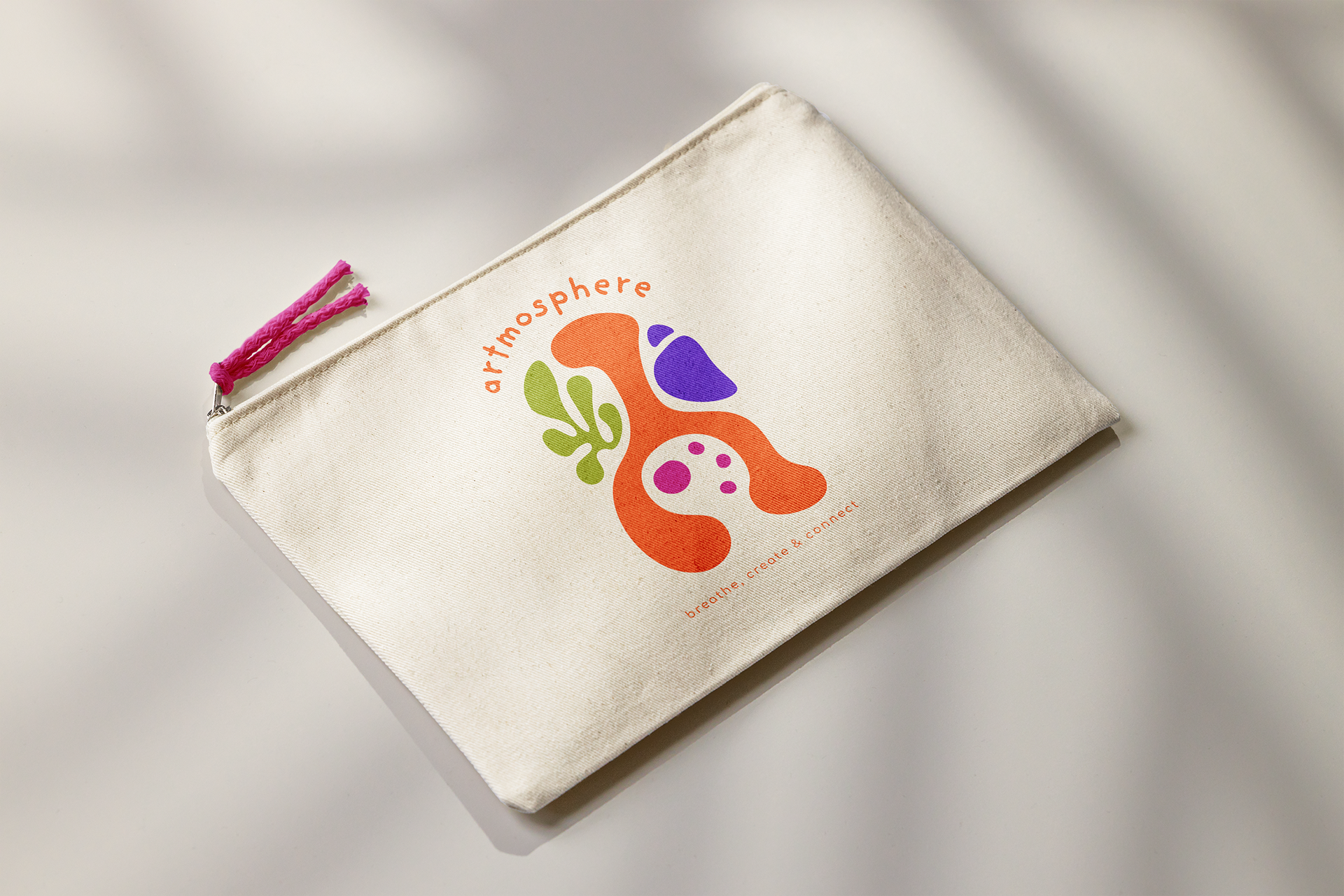
Utility Toiletry Pouches
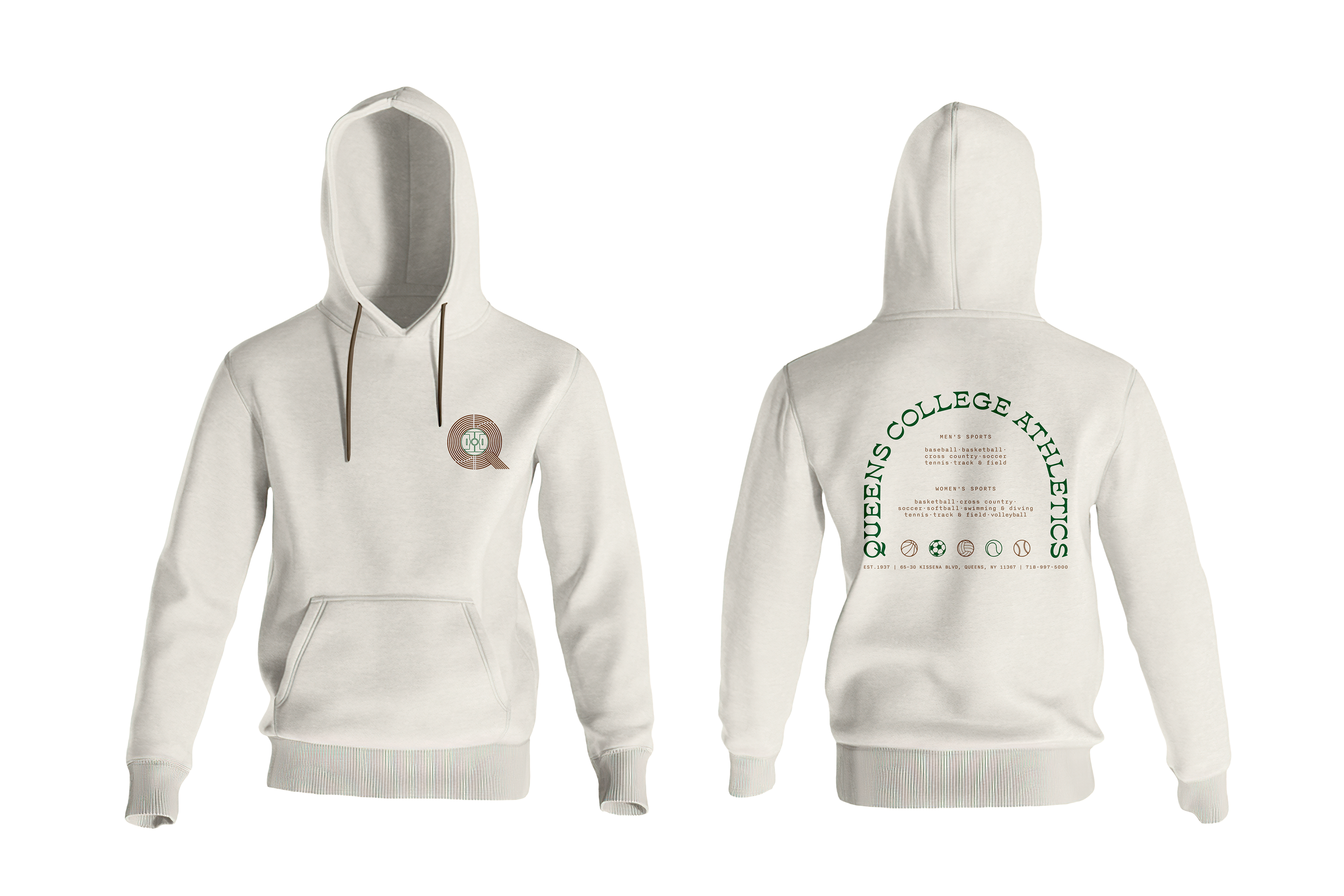
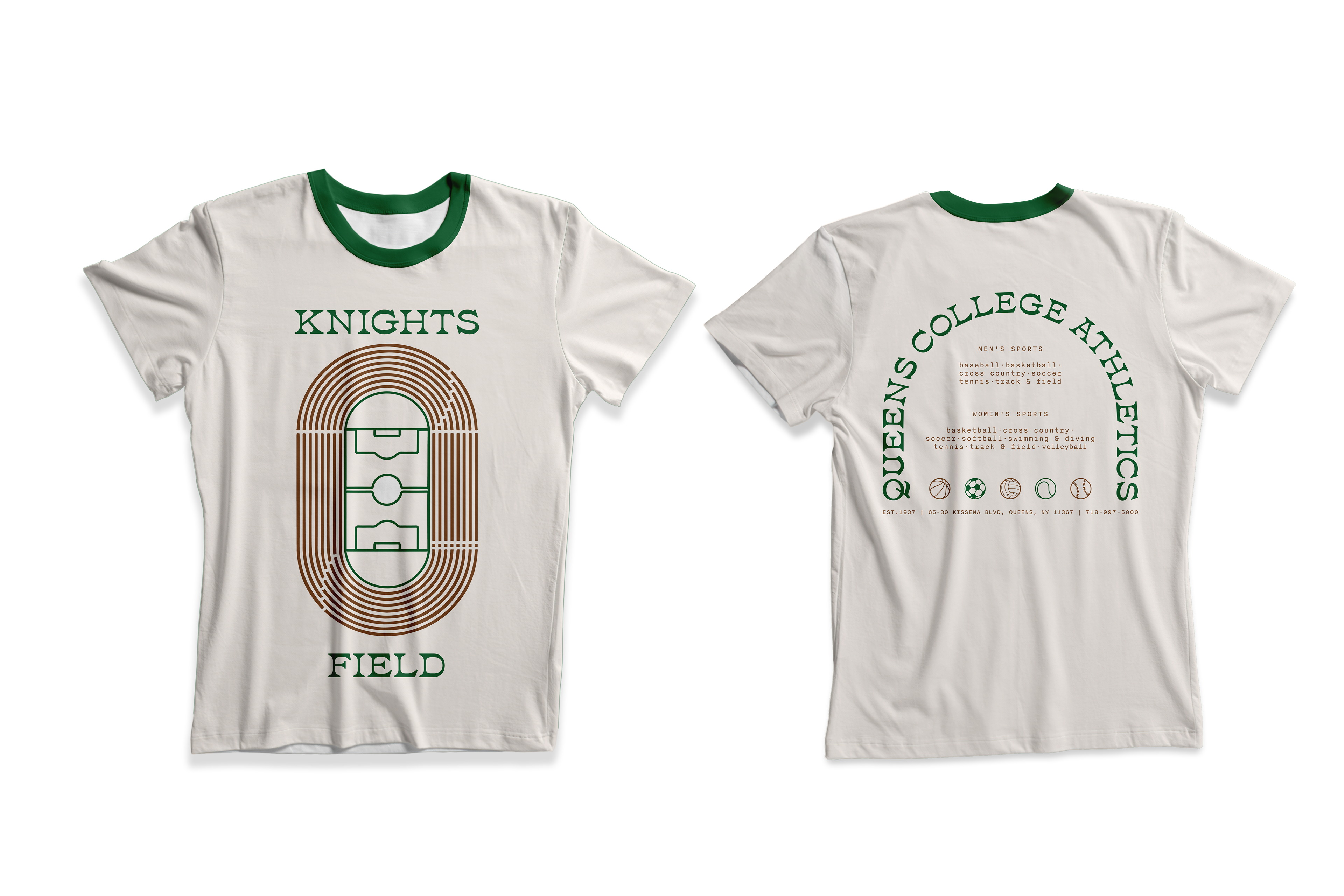
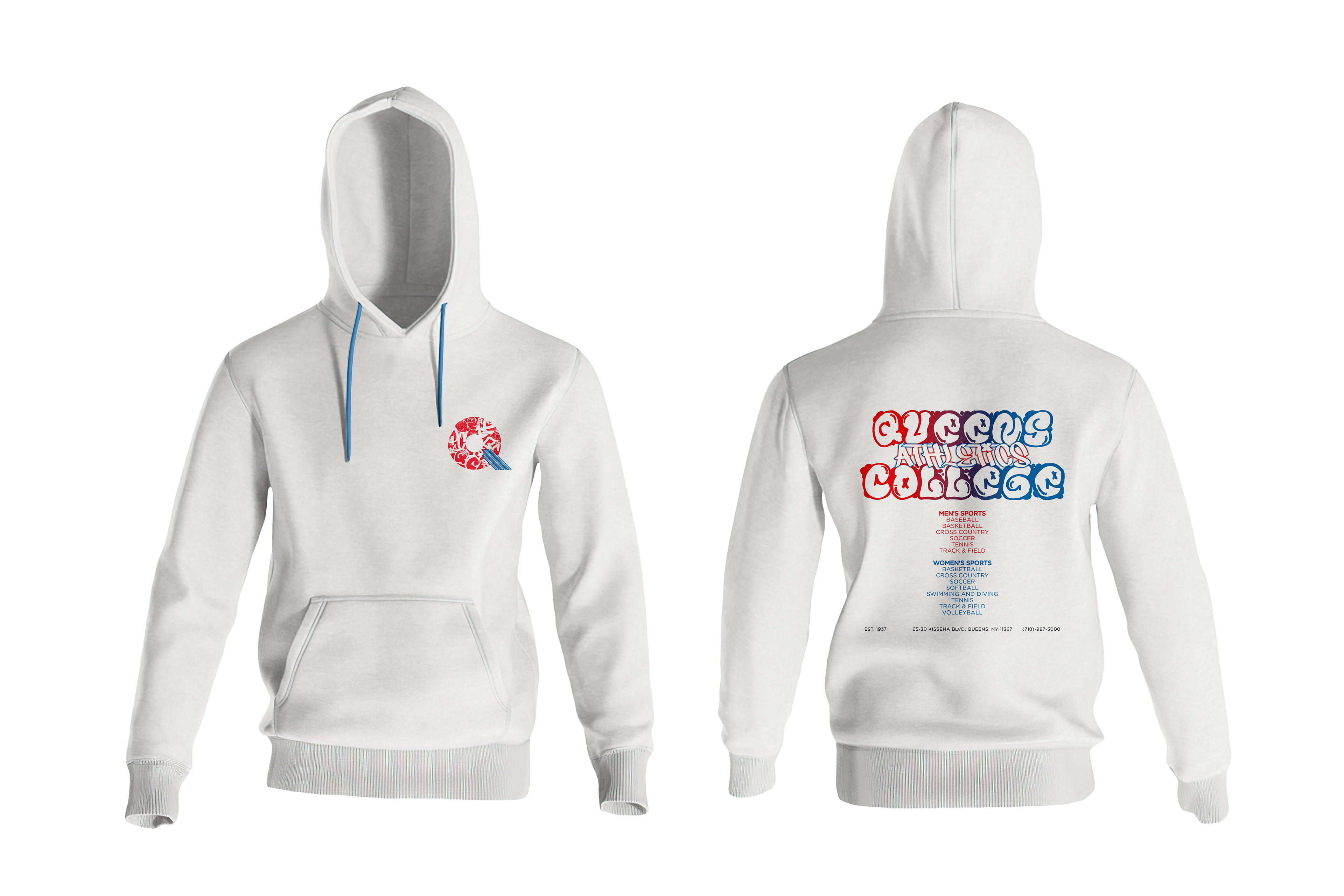
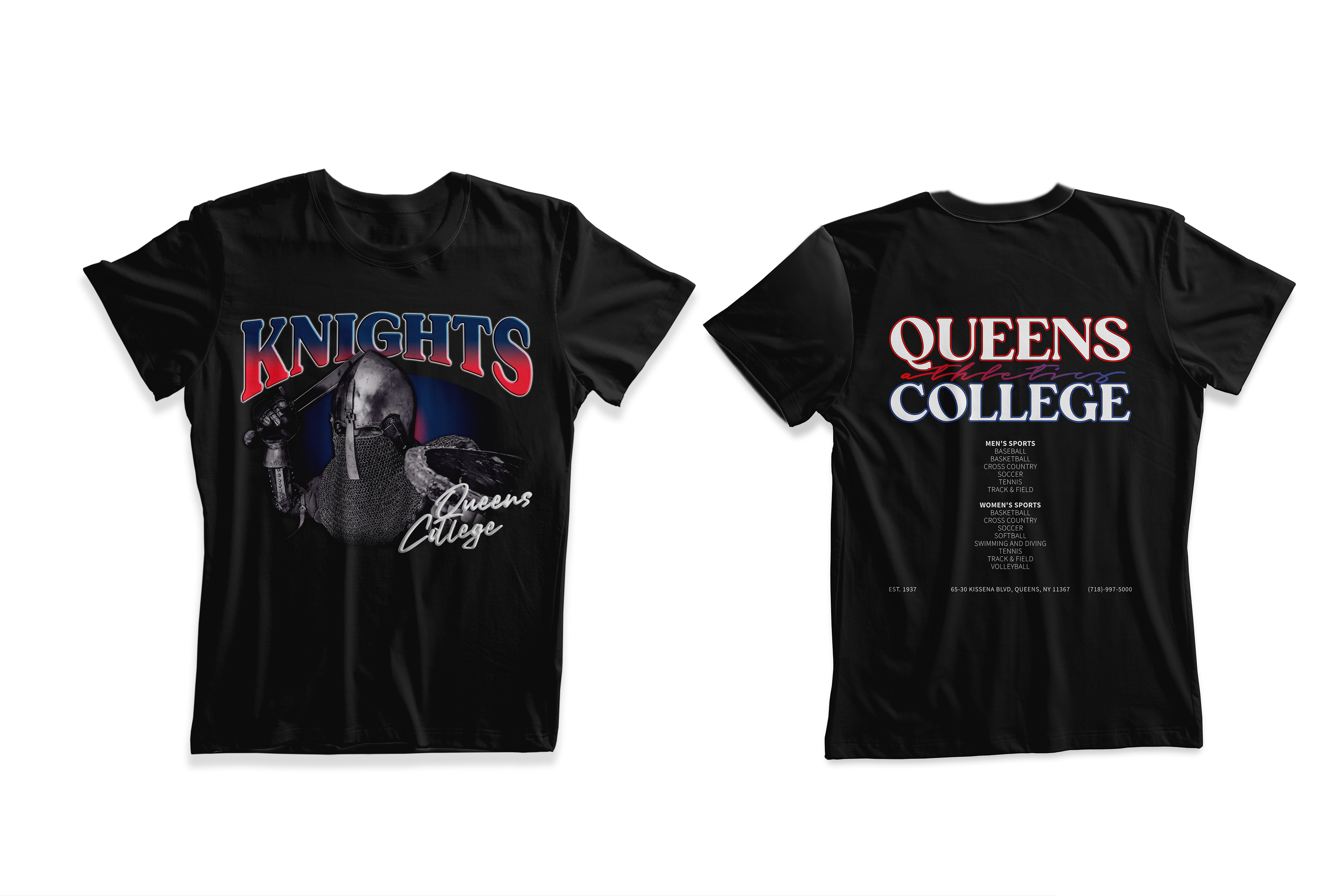
Queens College Goes on Tour (2023)
Merchandise rebranding to better promote Queens College for prospective and existing students.
Queens College believes in the power of diversity to create a vibrant and inclusive community. Through a rebranding effort, the aim to celebrate this diversity and foster a sense of unity through the synergy of the original logo to be an interchangeable and captivating concert tour inspired merchandise.
The interchangeable logo reflect the unique identities and cultures of our students, allowing them to express their individuality while showcasing the beauty of the college’s collective tapestry. The concert tour inspired merchandise captures the energy and passion of our diverse community, using bold designs that merge elements from our logos with modern aesthetics.
This rebranding will serve as a visual representation of Queens College's commitment to inclusivity, creating an atmosphere where every voice is heard and celebrated.
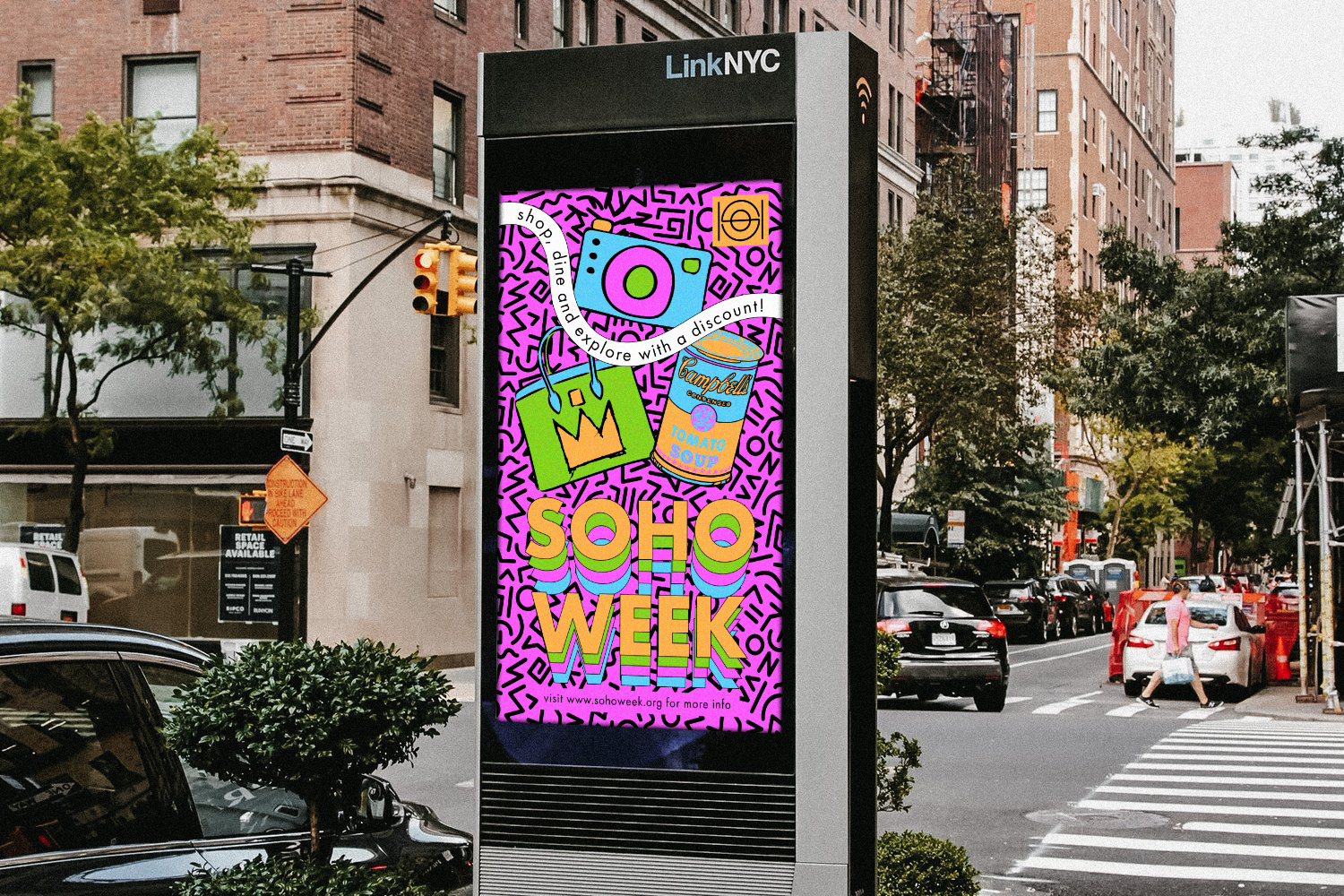
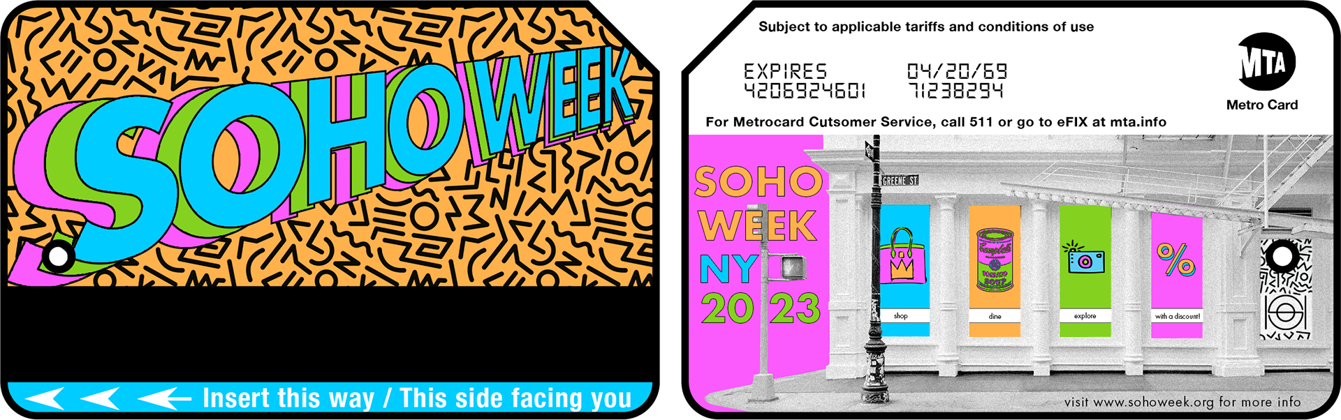
SoHo Week (2023)
Digital ad campaign that effectively communicates the unique character and benefits of SoHo in a way that connects with the target audience.
SoHo Week is a week long event that will give the individuals an opportunity to explore what SoHo has to offer: to see amazing art, to shop in a big variety of stores and dine in world famous restaurants. All that, in discounted prices.
Colorful pop-art and offset design inspired by Tyler Spangler, a Southern Californian graphic designer, in addition to Mike Perry's work for Broad City, a show about the lives of two New York City women.
Limited edition MetroCards with discounted rides are designed and available to be purchased in all SoHo MTA stations.
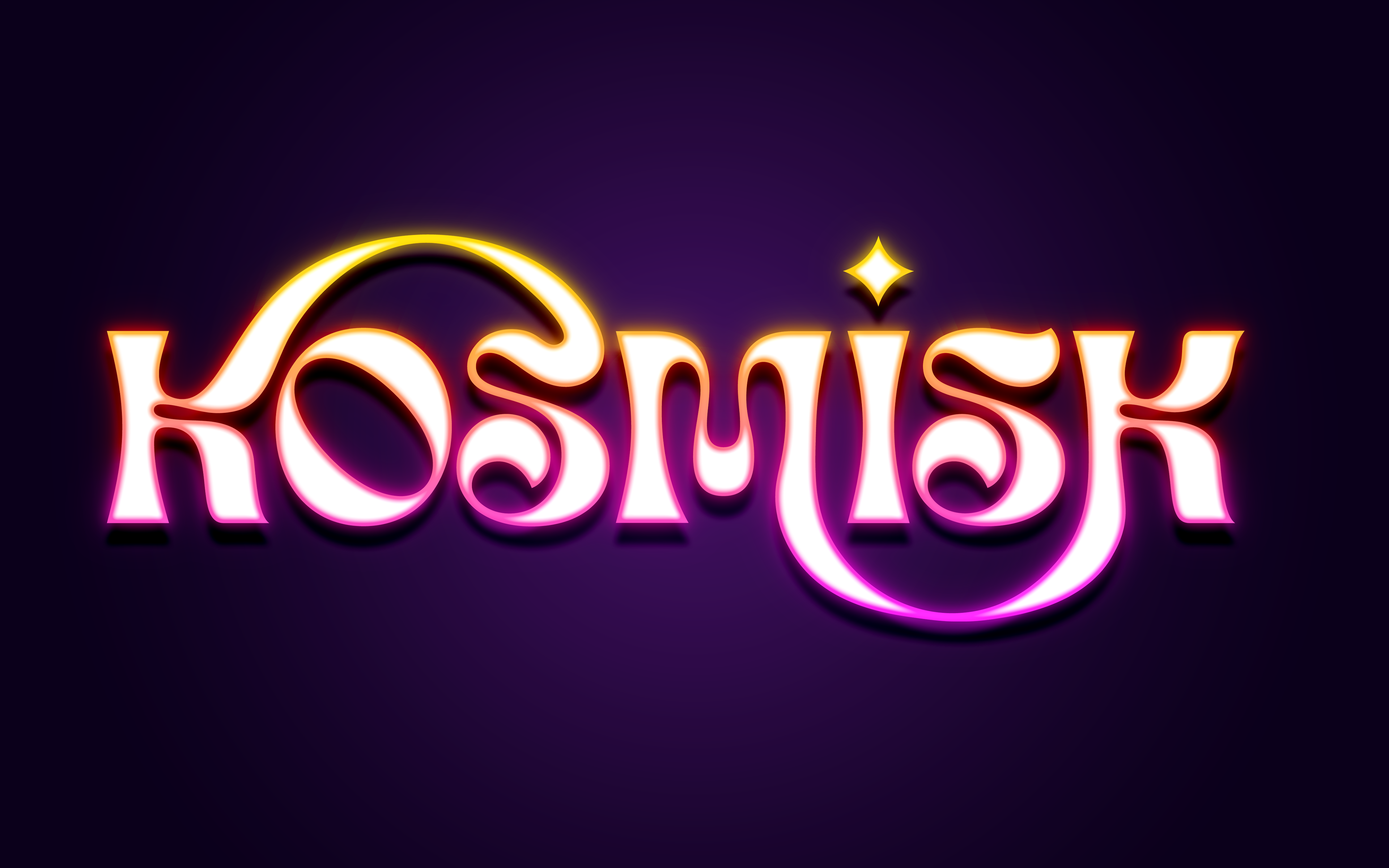
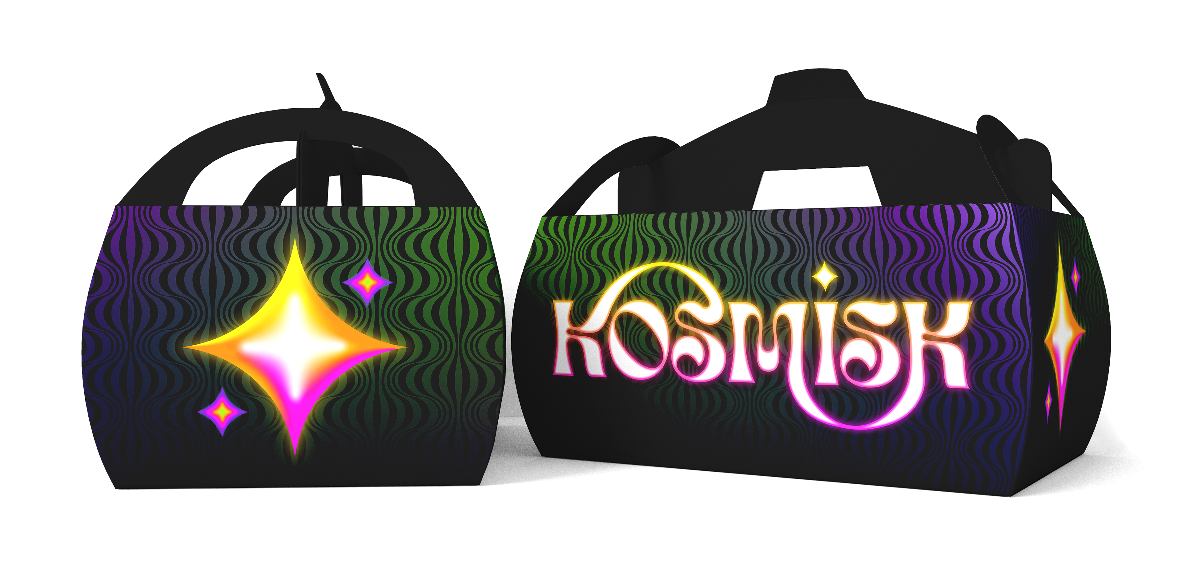
Kosmisk (2022)
Visual identity, branding and advertising for a conceptual hip Scandinavian restaurant.
Inspired and based on the styles of Verner Panton, a Danish furniture and interior designer, Kosmisk connects traditional Scandinavian dishes with retro futuristic design.
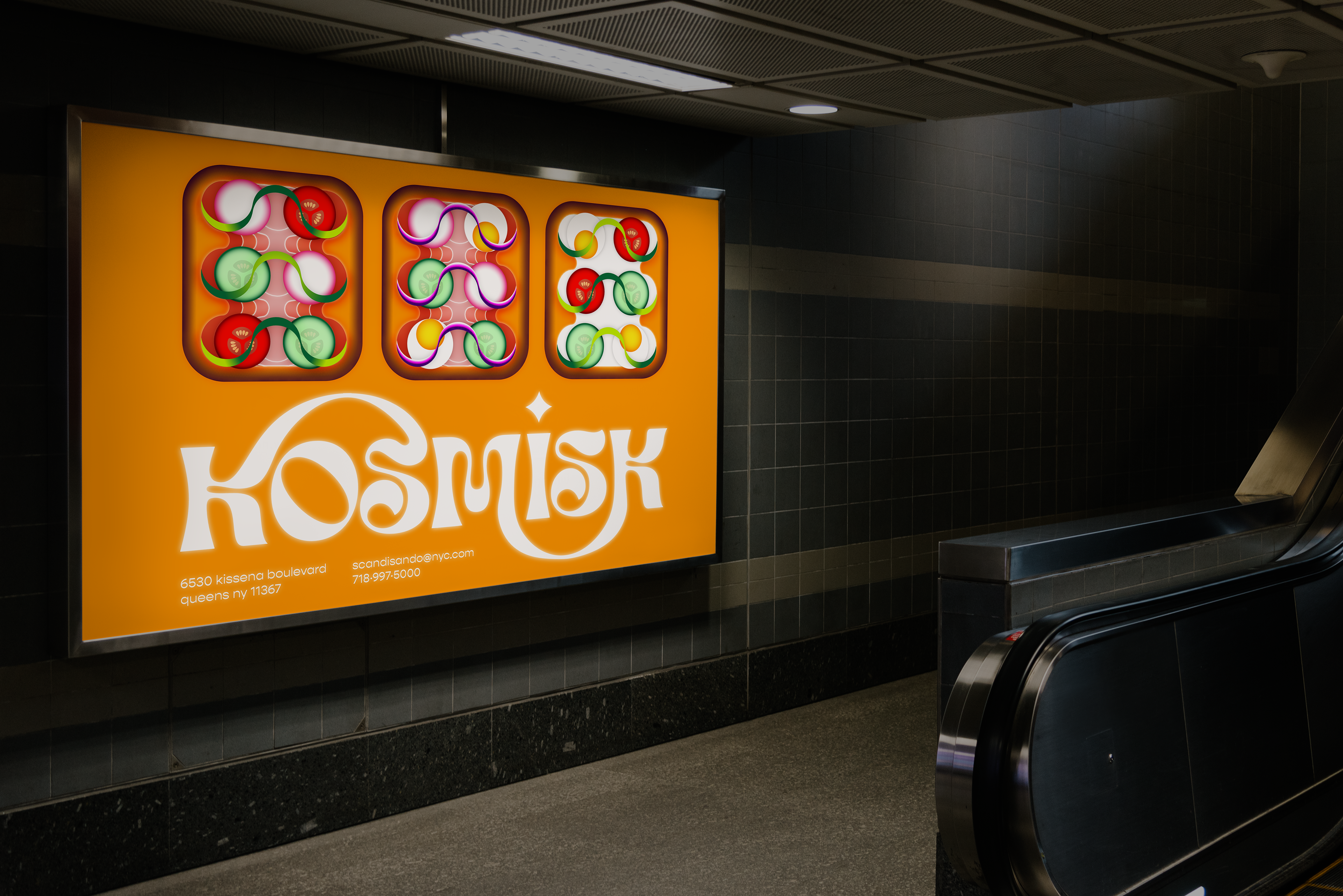
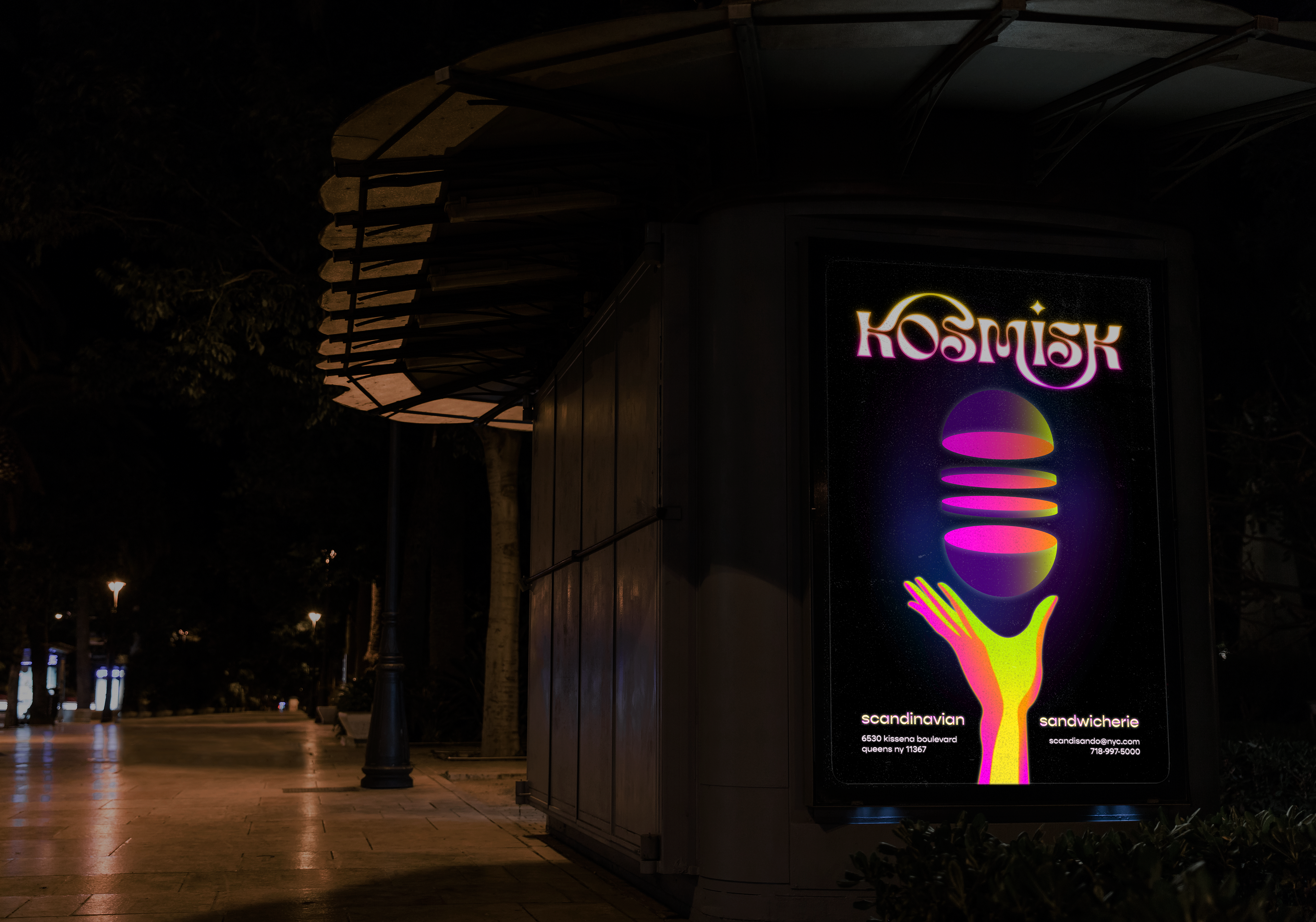
Advertising
Wild postings of Kosmisk ads in subways and JCDecaux
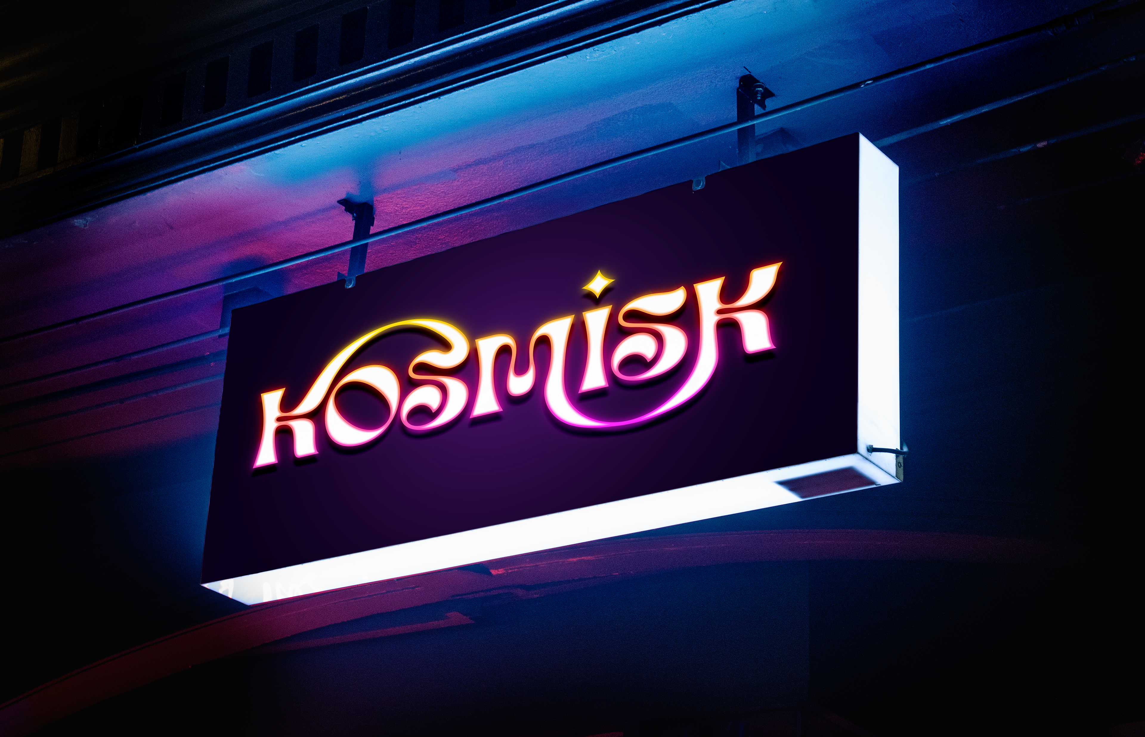
Signage
Storefront
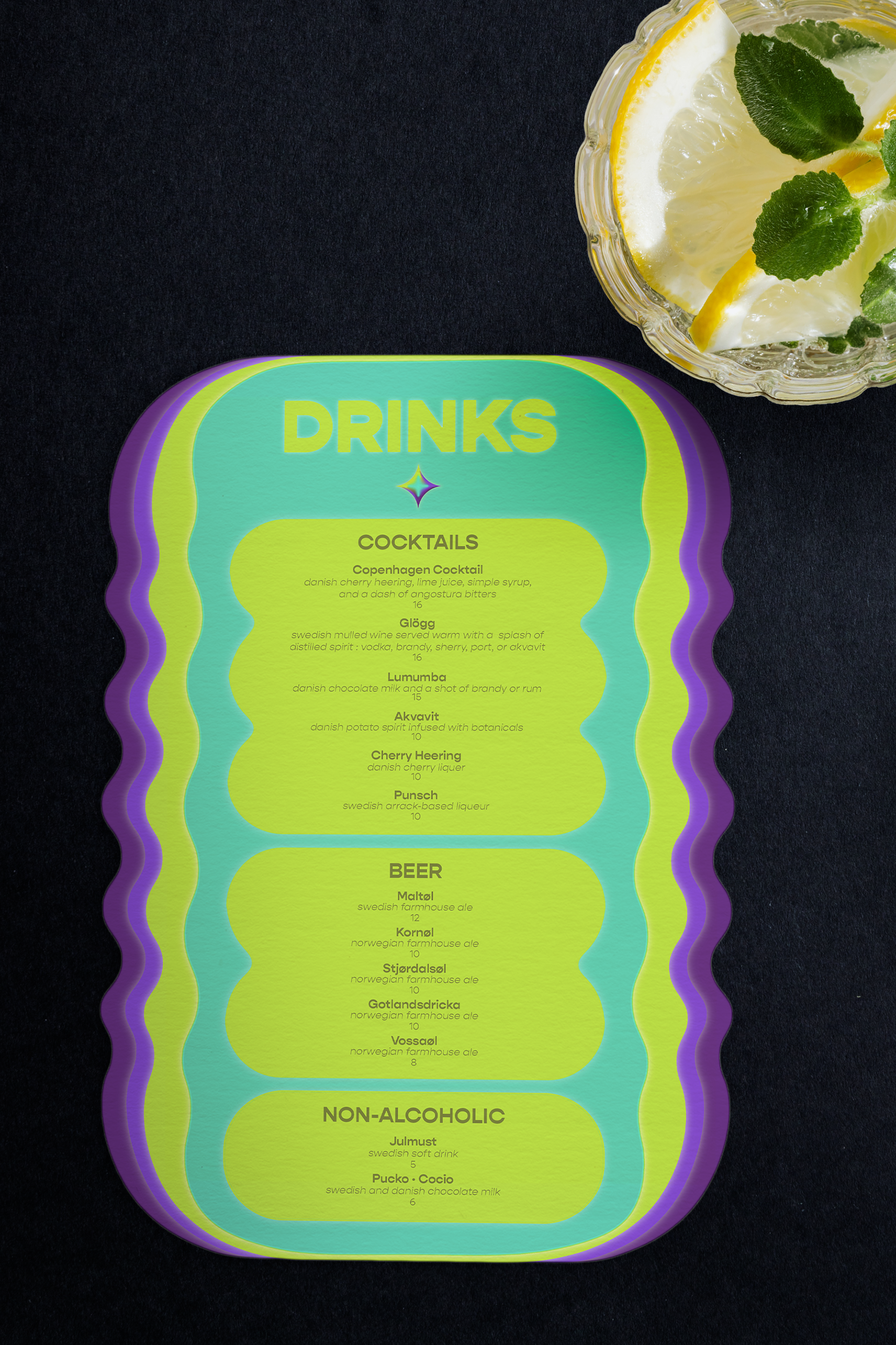
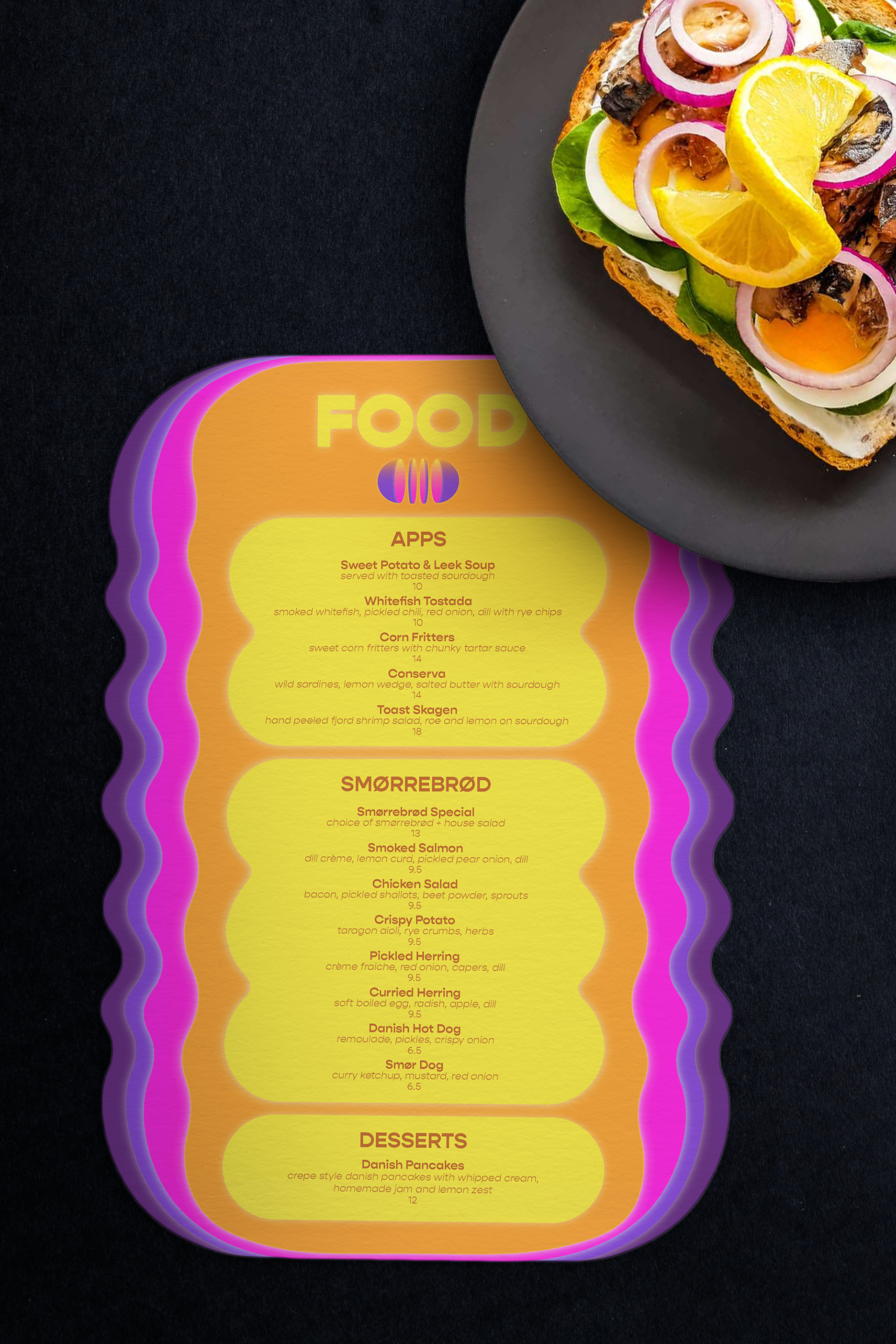
Menu Design
Drink menu is curated after deep research of popular Scandinavian beverages
Food menu is based on the menu of Smør, NYC
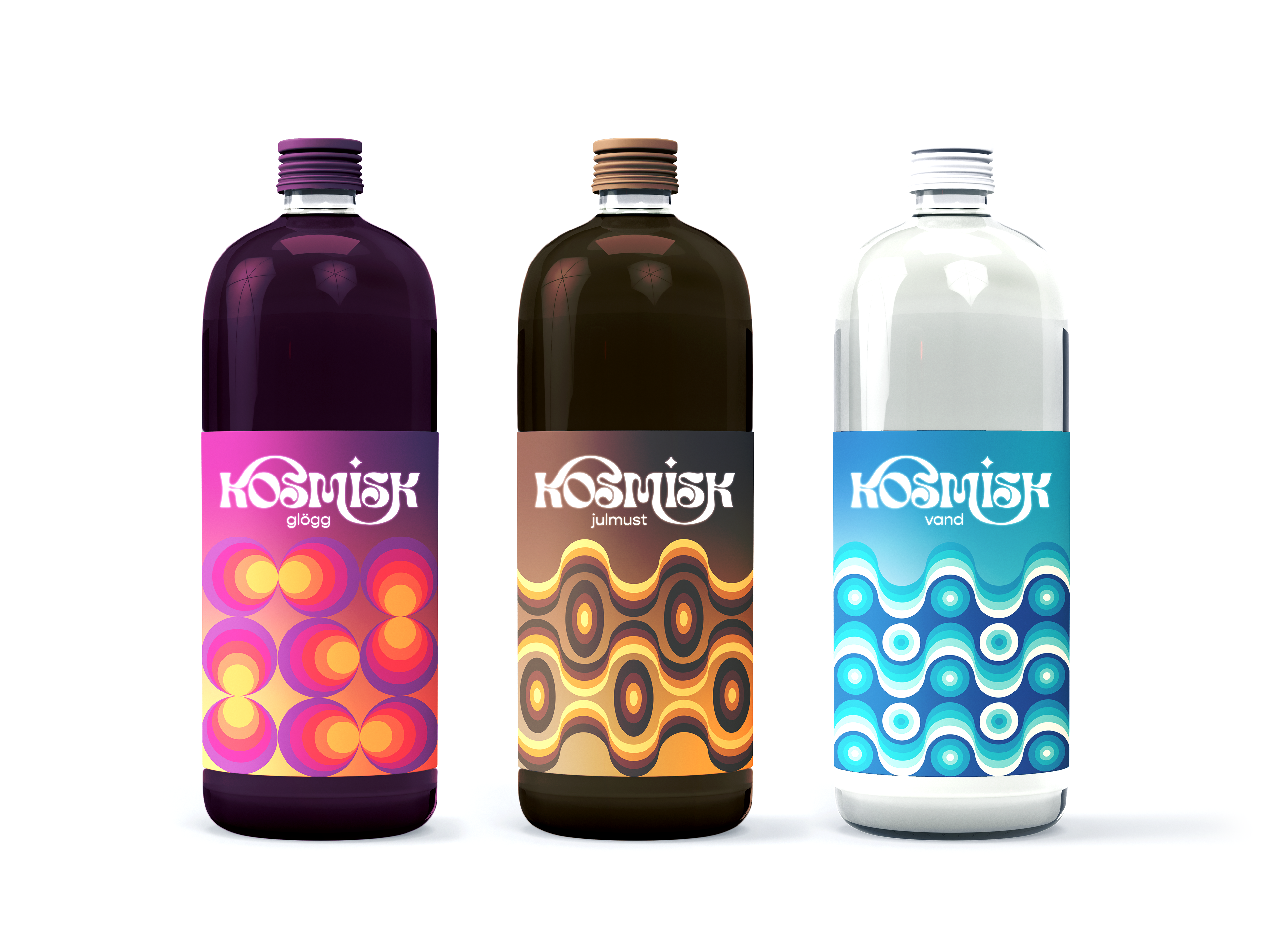
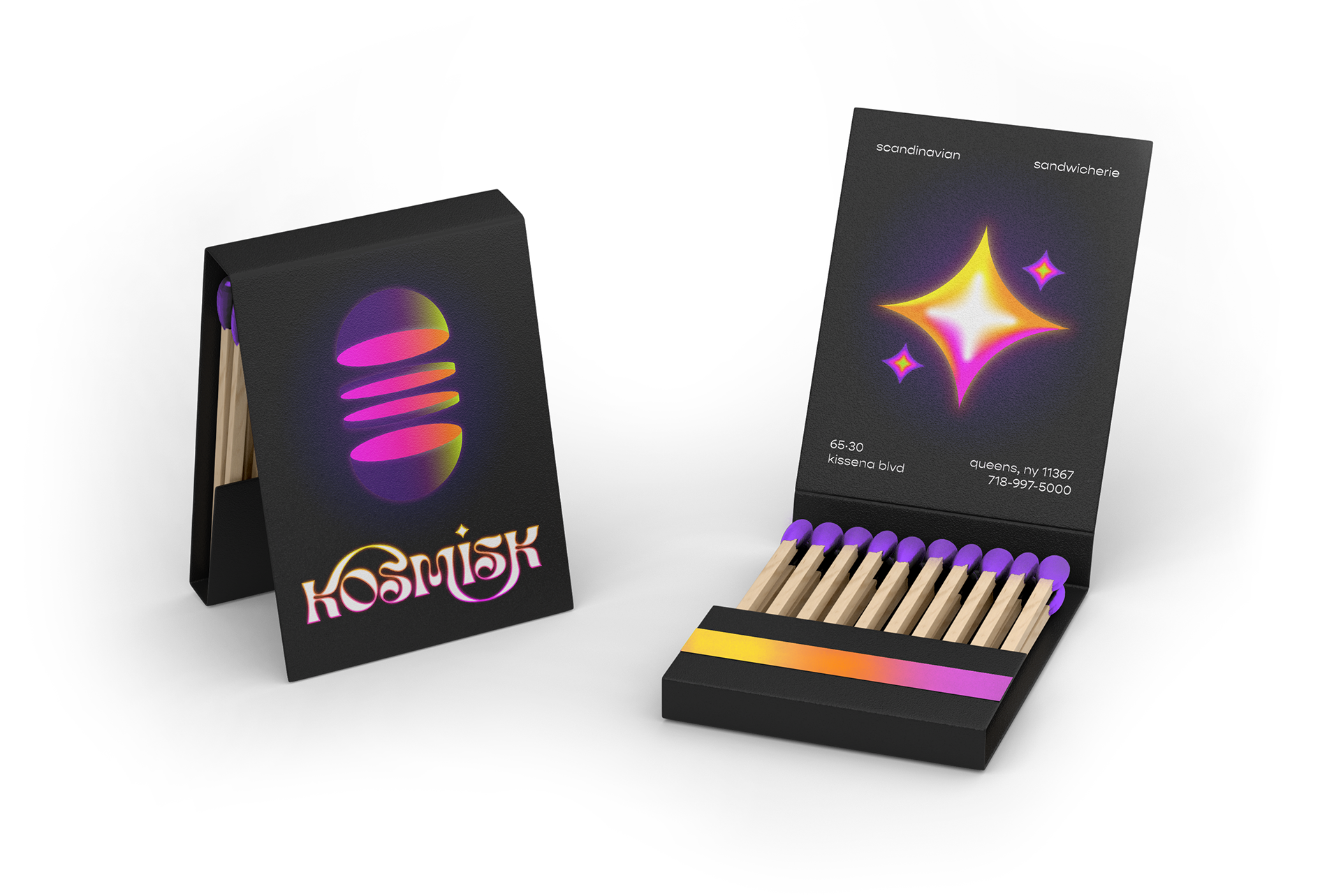
Merch Design
On-the-go drinks
Matchbook and take out boxes
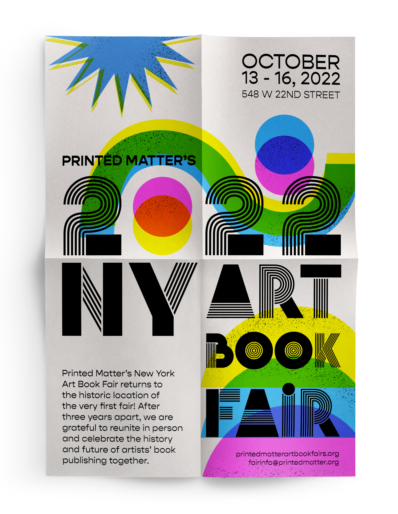
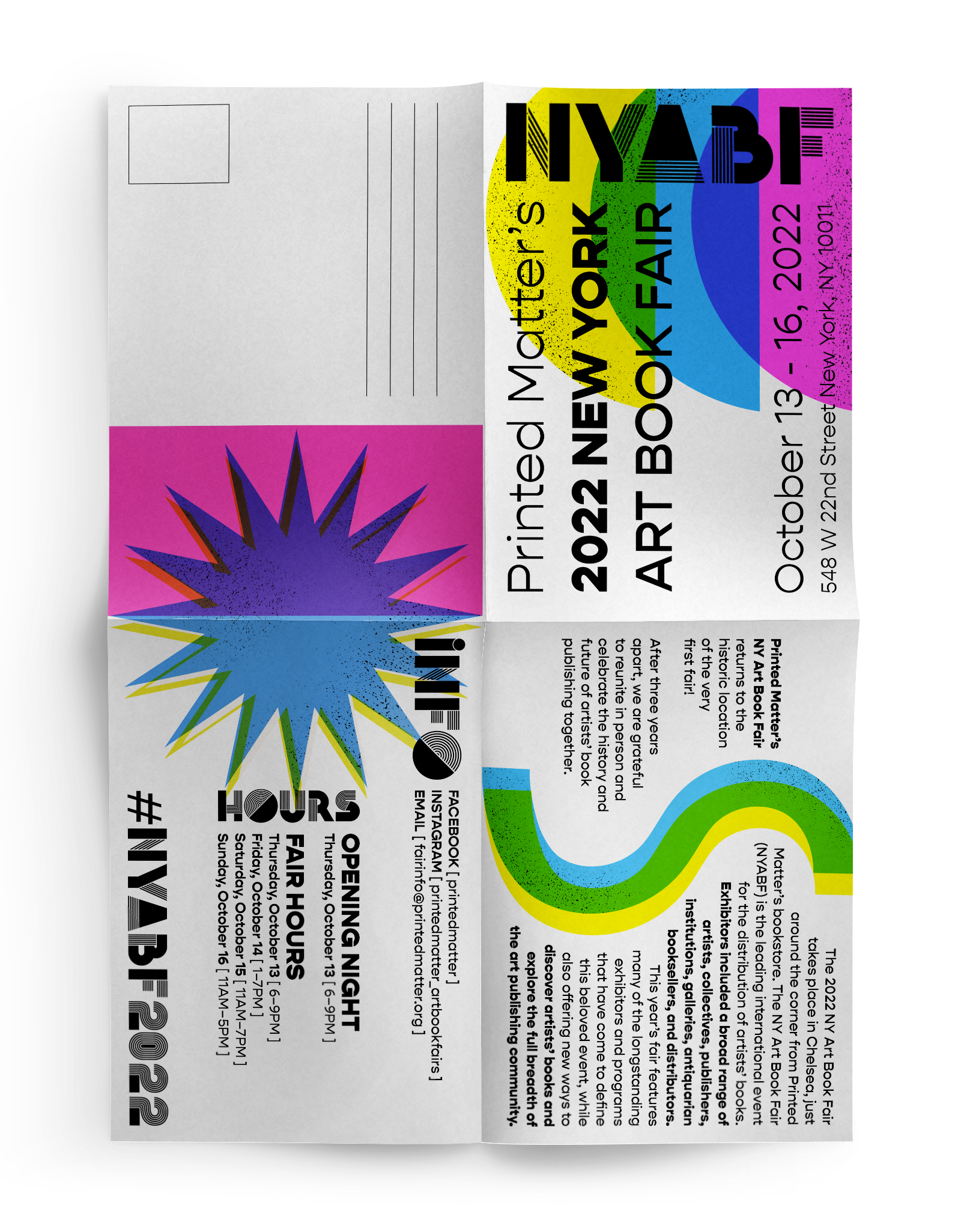
PRINTED MATTER’S NY ART BOOK FAIR (2022)
2-in-1 poster and mailer design for a book fair.
Individual spaces created on the folds of an A4 paper are filled with its own colorful risograph print style designs. Illustrated on Adobe Illustrator and finalized with text on Adobe InDesign.
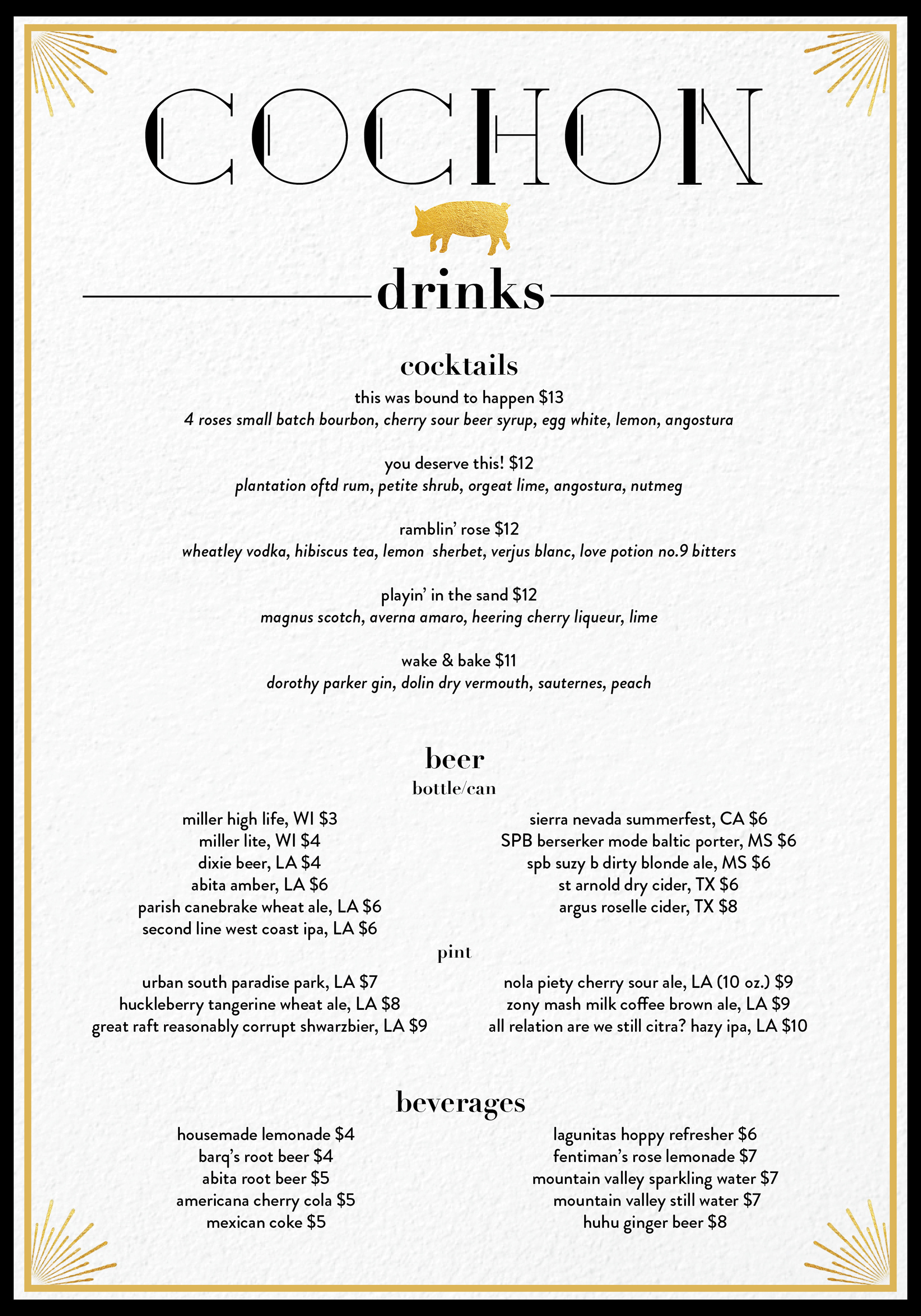
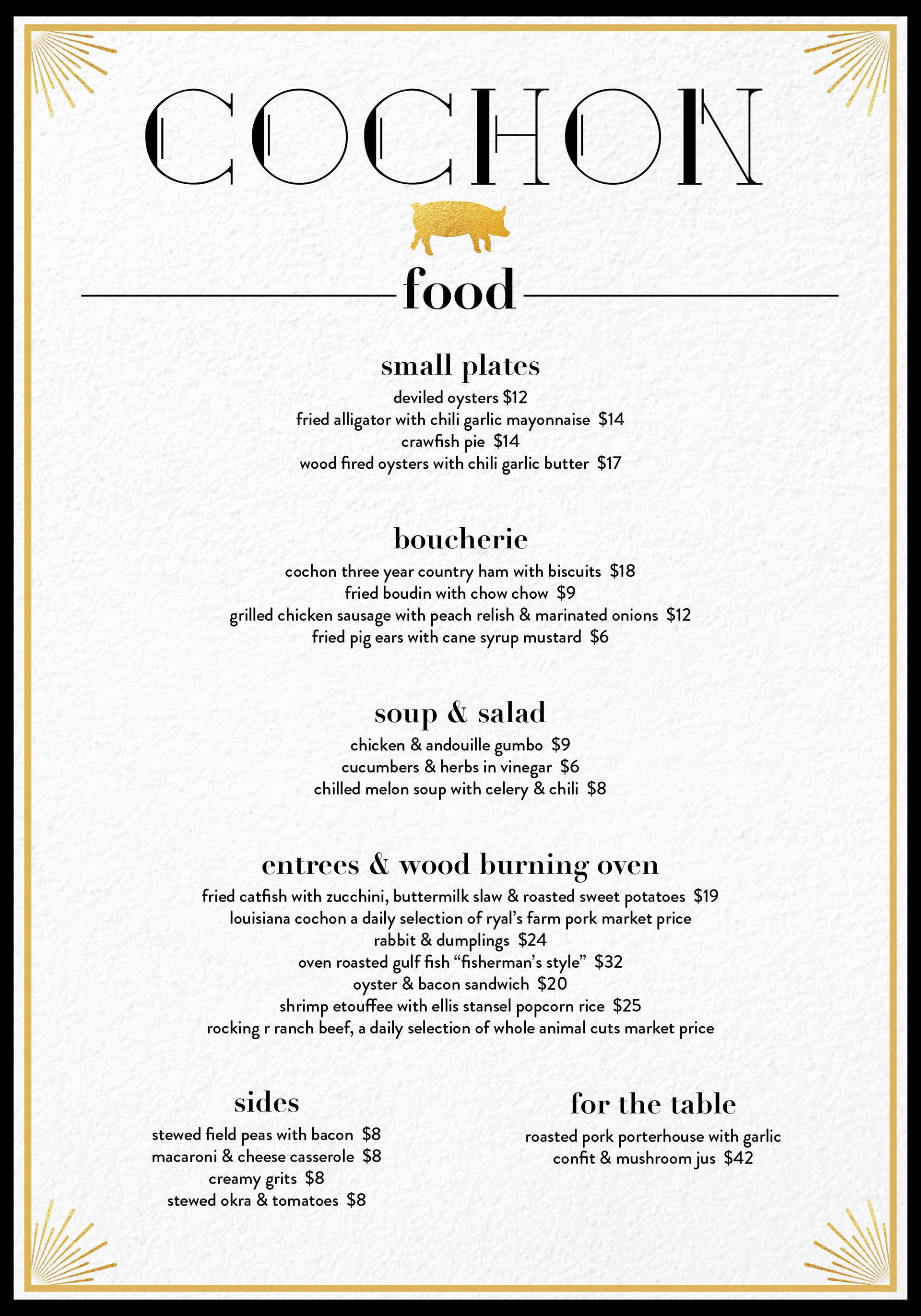
COCHON REDESIGNED (2020)
Rebranding and menu design for Cochon, a traditional Cajun Southern restaurant in New Orleans.
To fit the high end business casual feel of the restaurant, a clean logo of gold pork elevates the vibe of the restaurant. The signage is redesigned with a serif type that includes light ornaments. The menu redesign follows the new signage with minimal ornaments and thin borders. A classy serif type is used to divide categories of the menu and is paired with a clear and simple san-serif body.
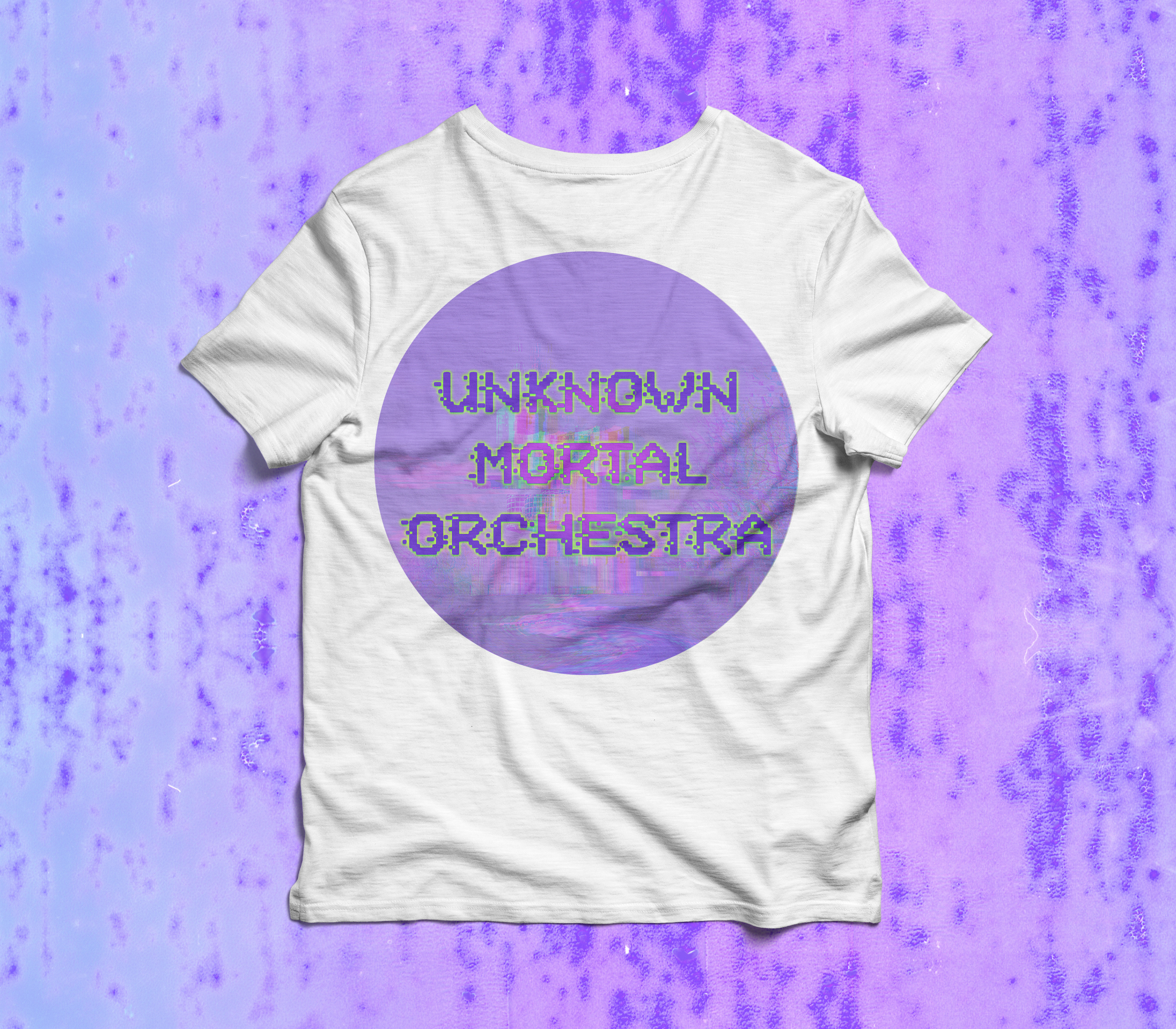
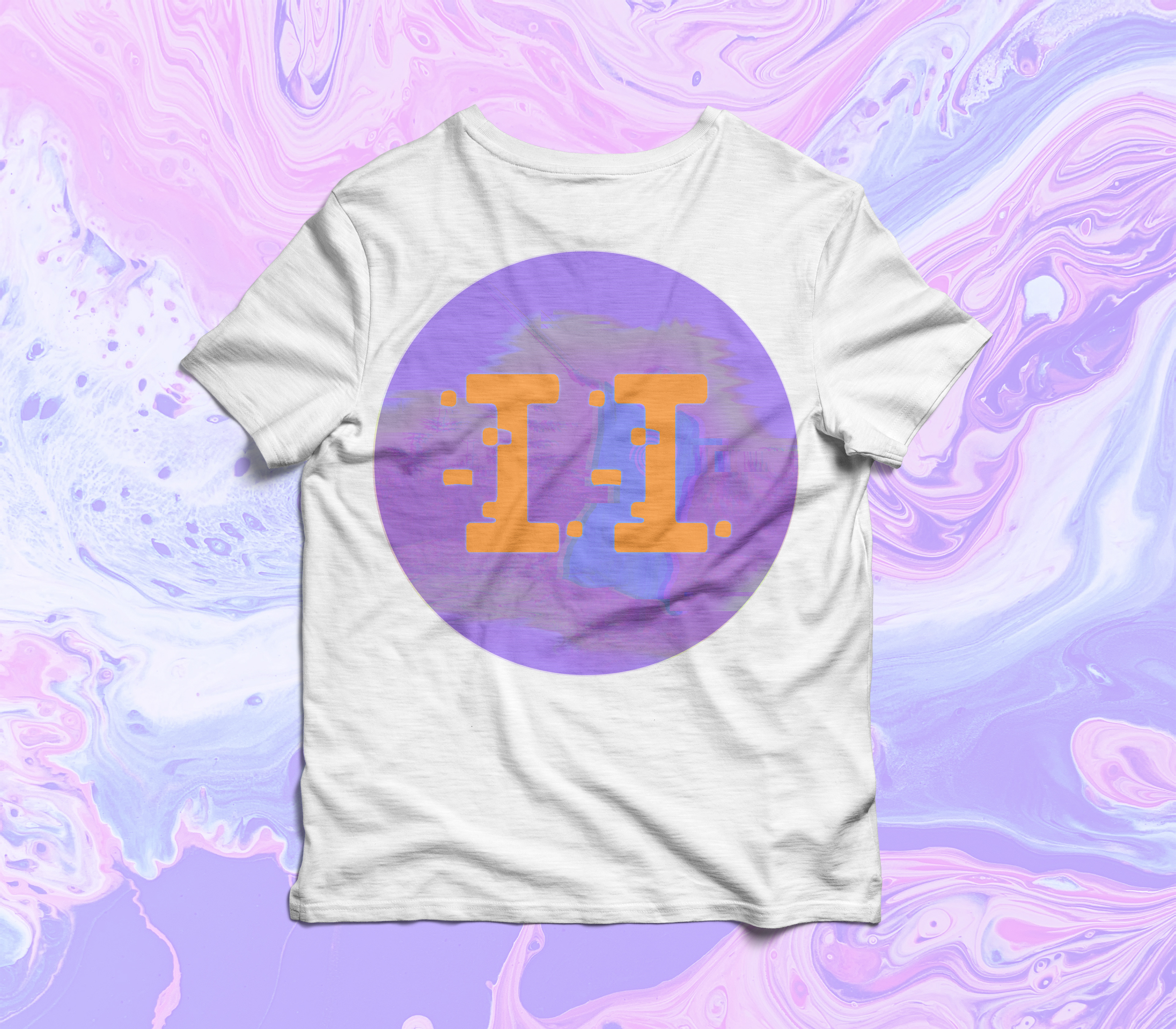
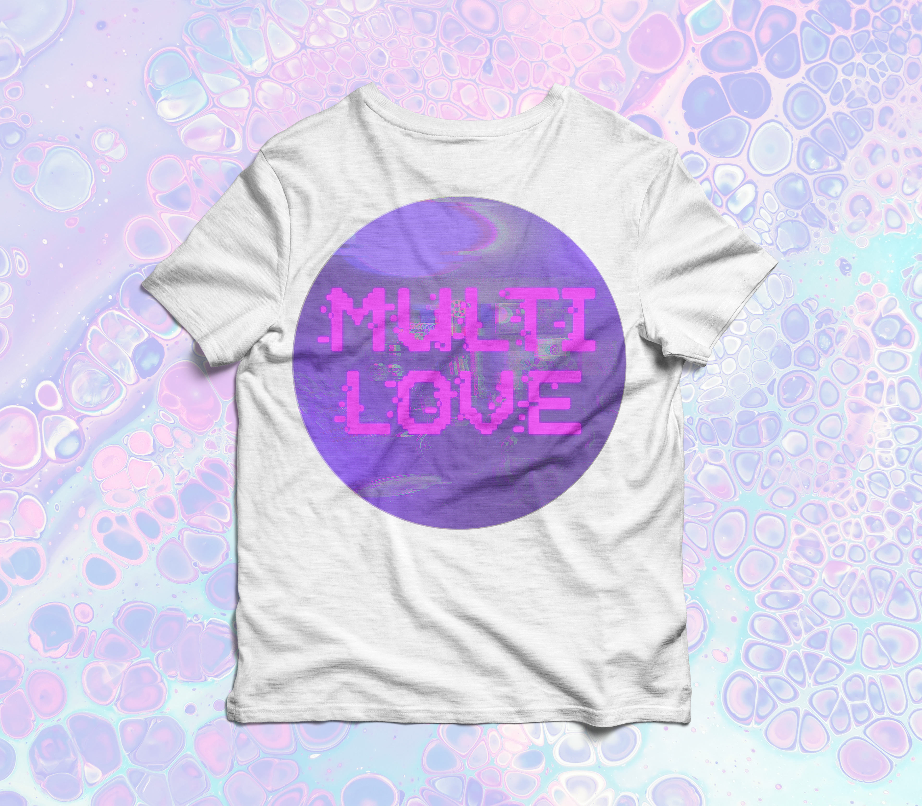
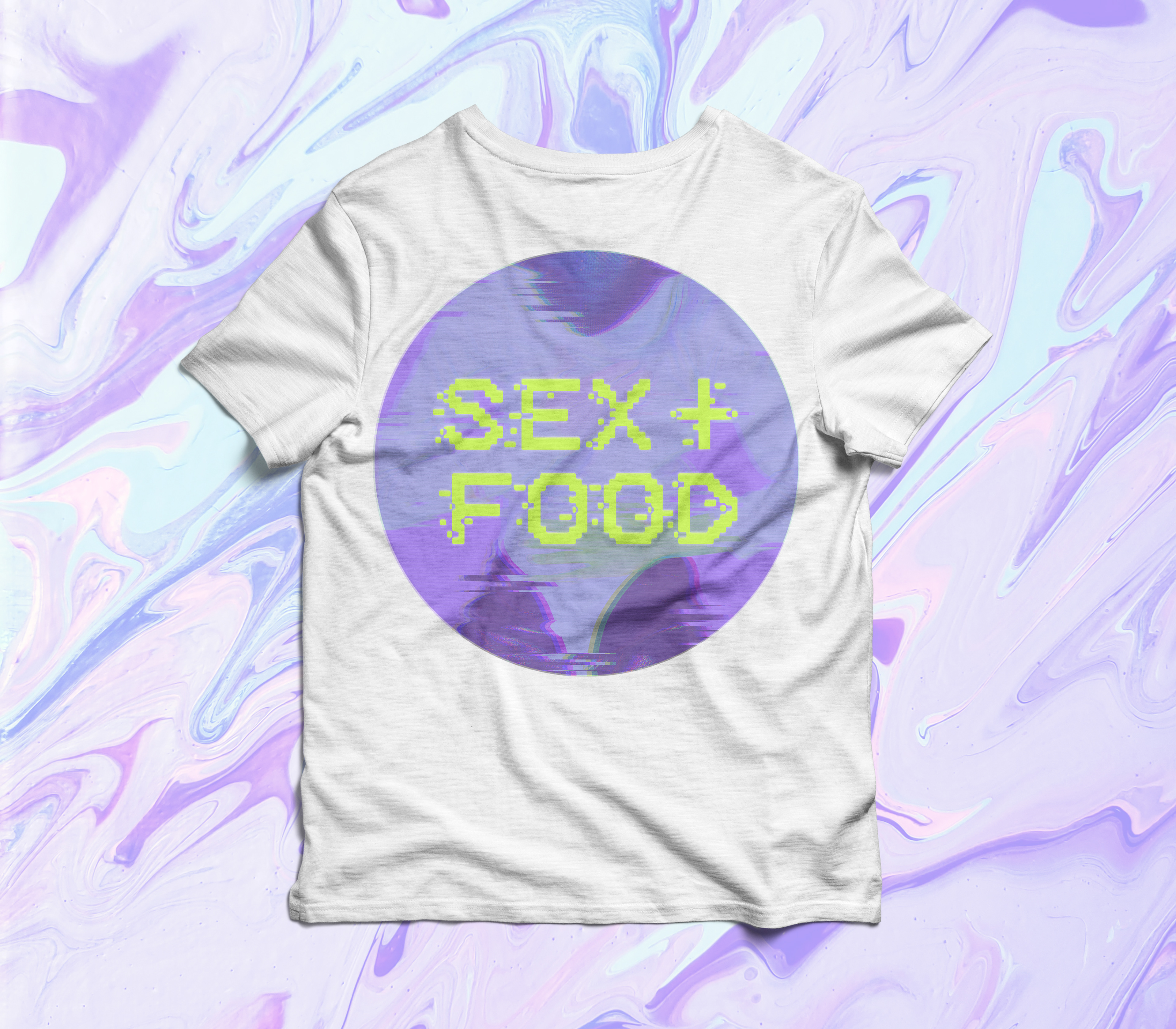
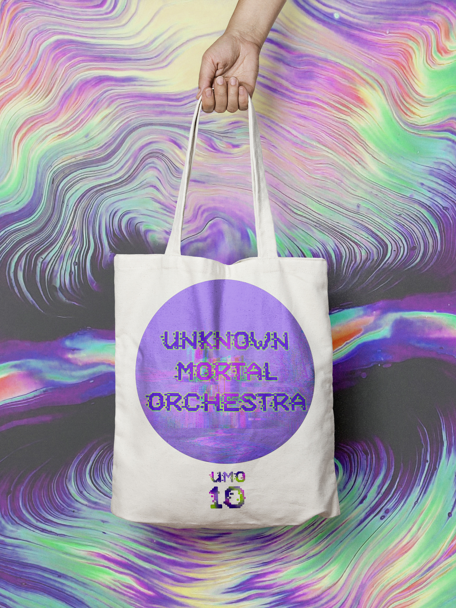
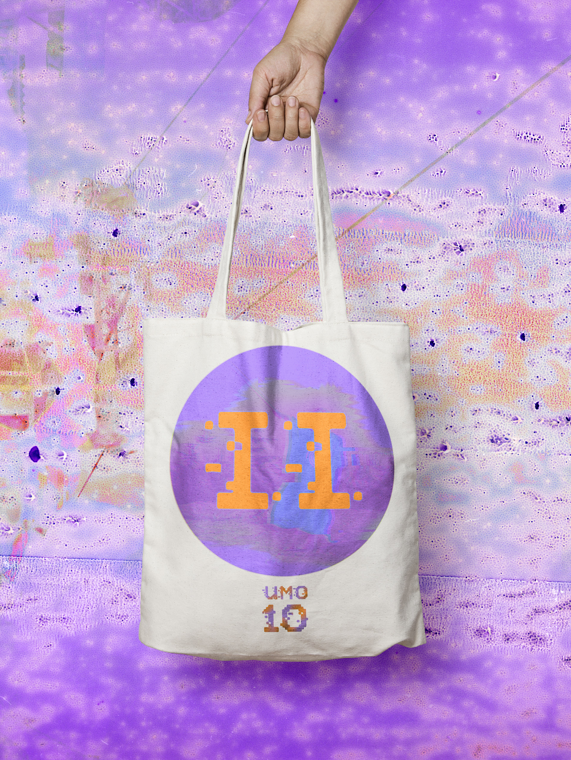
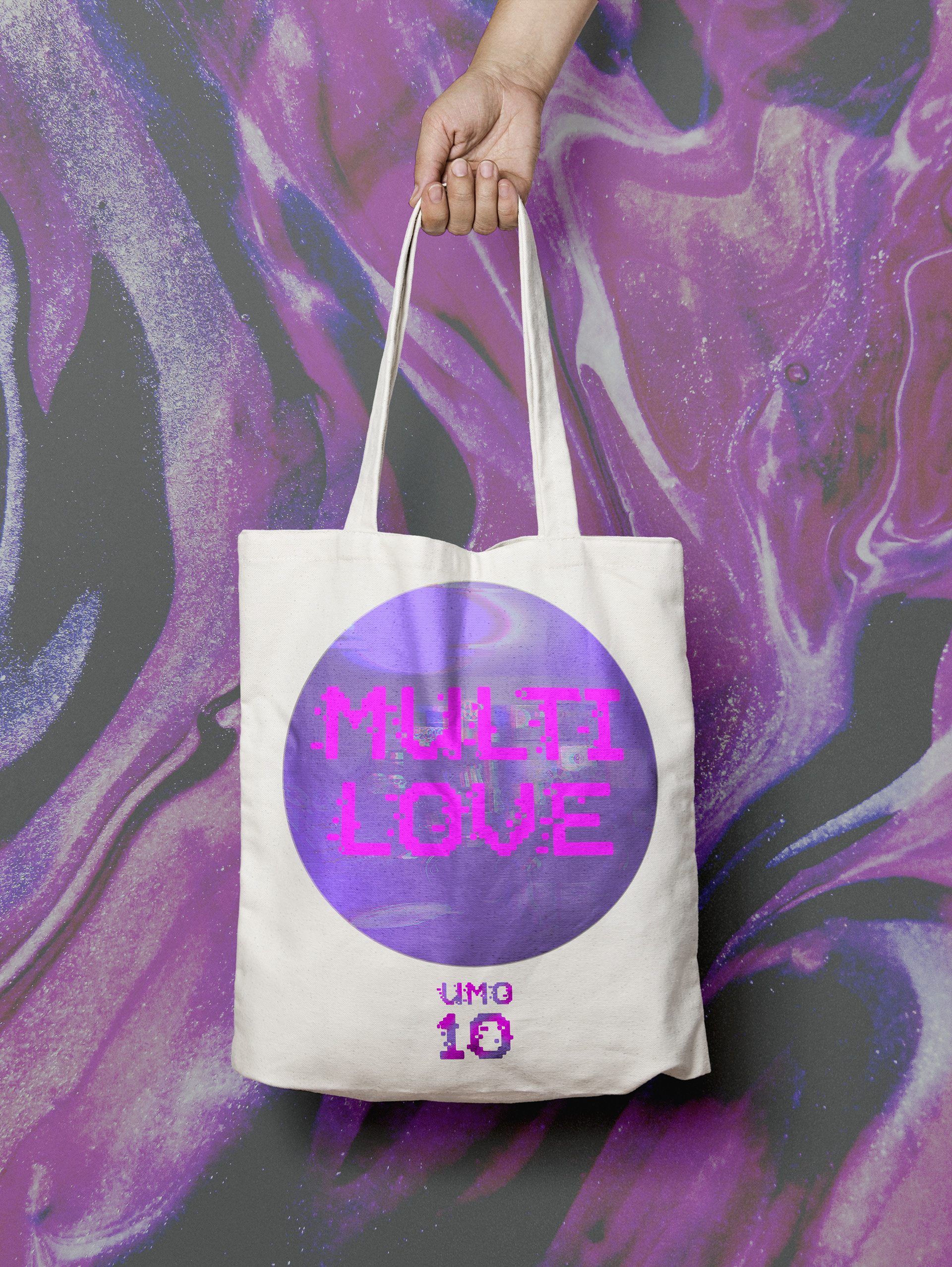
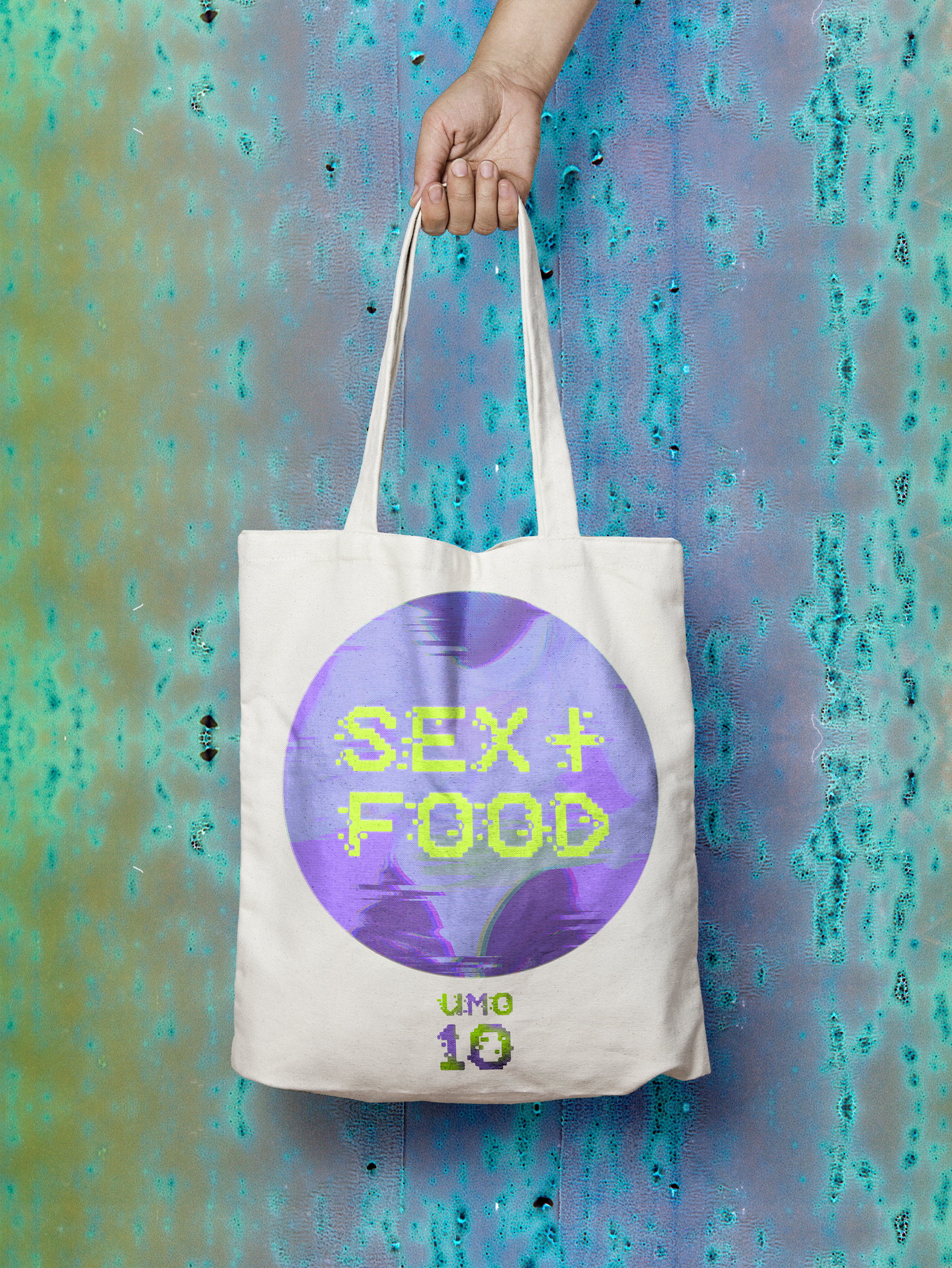
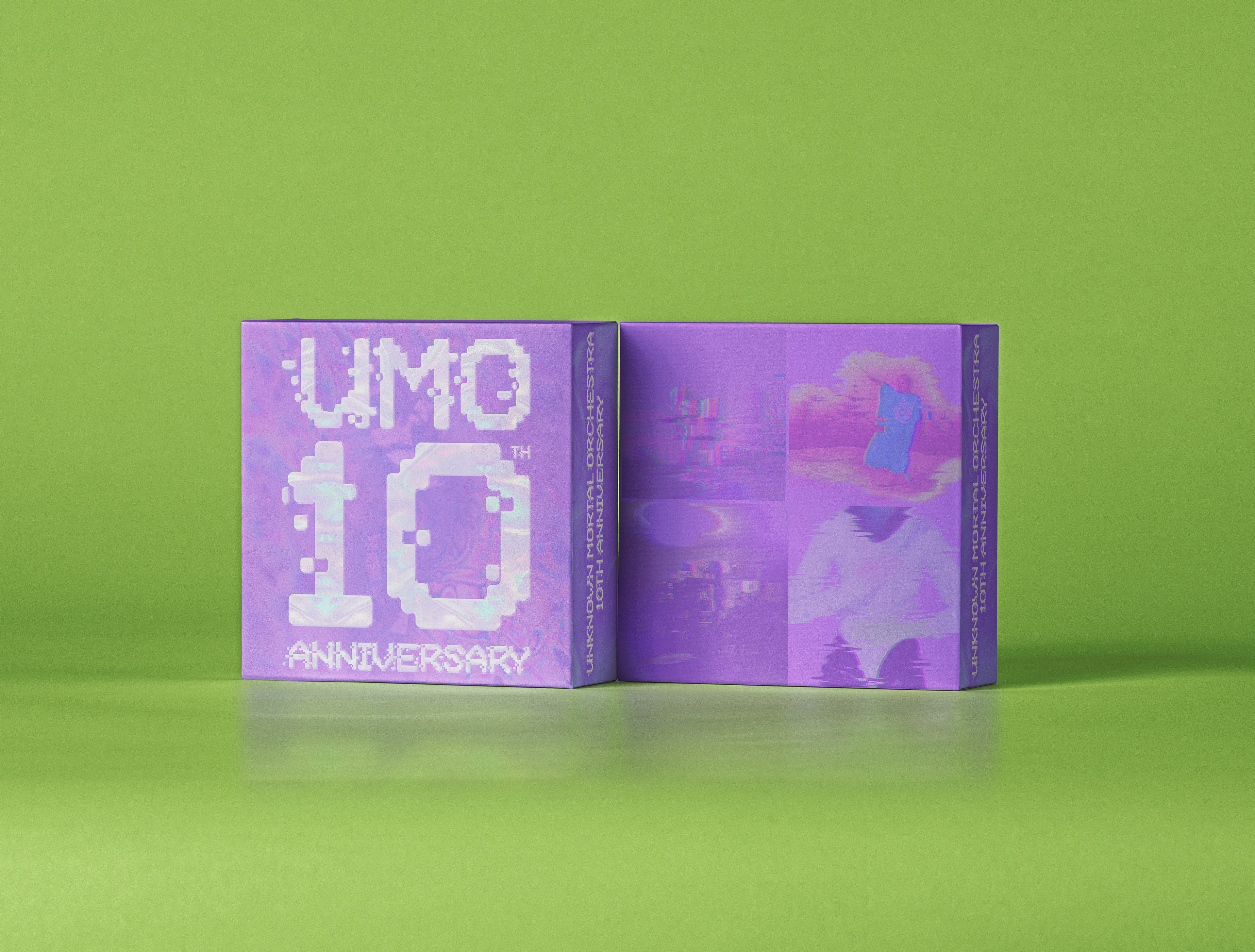
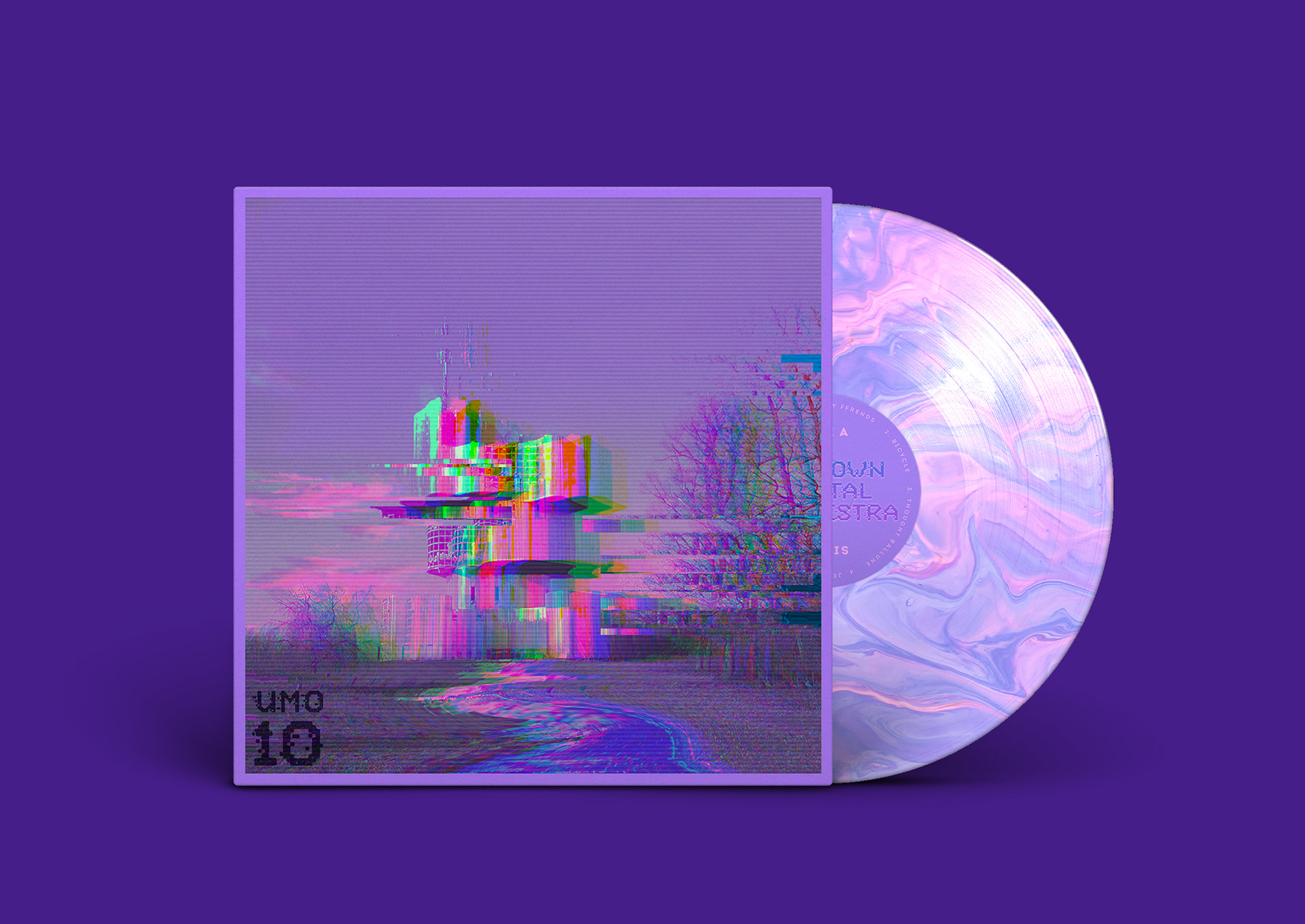
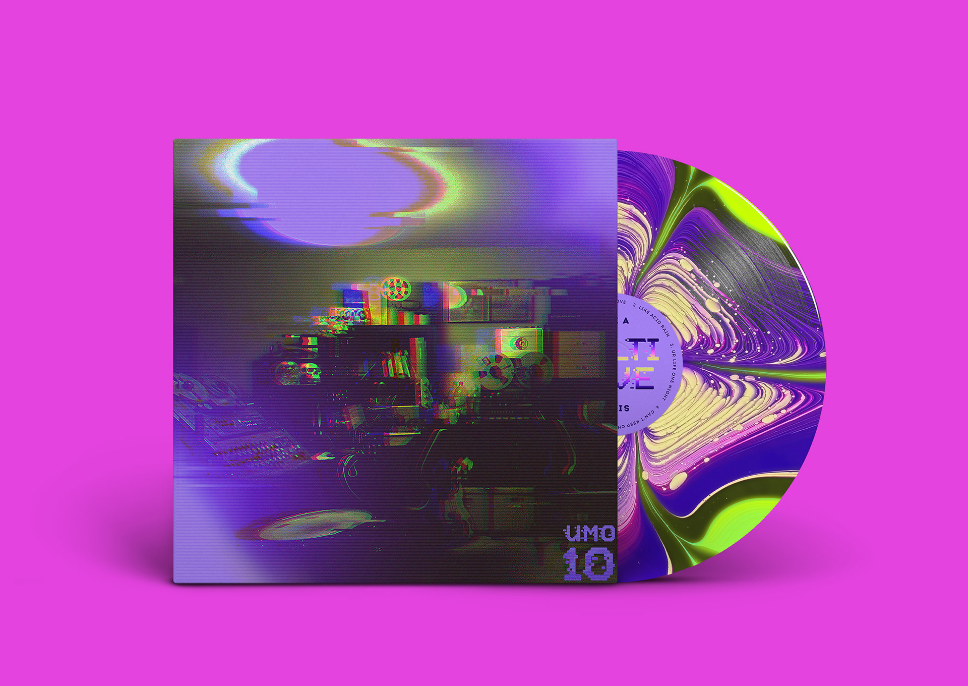
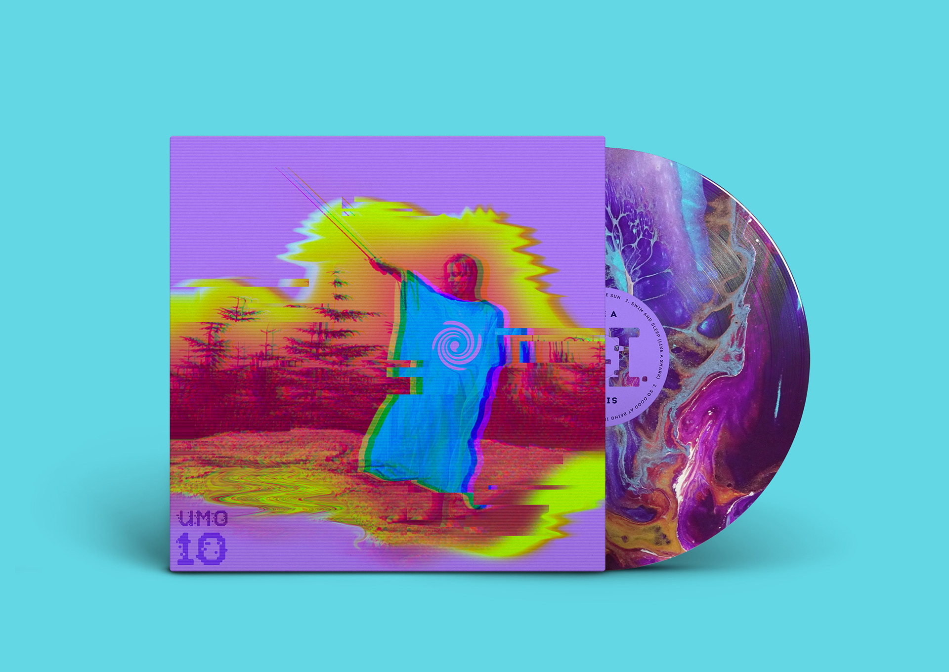
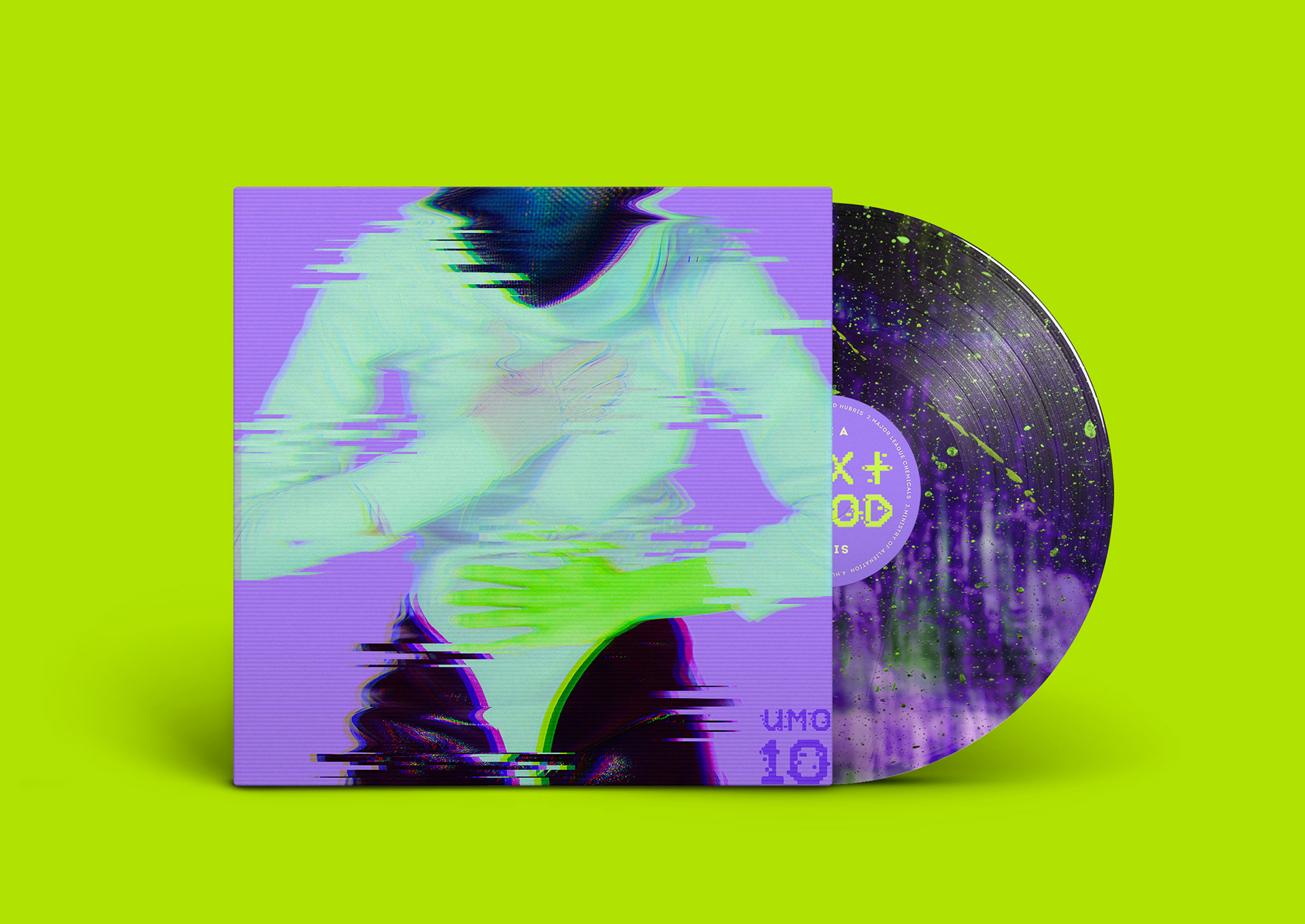
UMO 10 (2020)
Visual identity for Unknown Mortal Orchestra’s 10th Year Anniversary Limited Edition vinyl set and merch.
Using bright colors, fluidity, distortion and grain textures, the band’s existing album art are redesigned to represent the sound of modern psychedelic rock. Unlike your typical black vinyl, this limited edition pack includes beautiful vibrant acid textures.
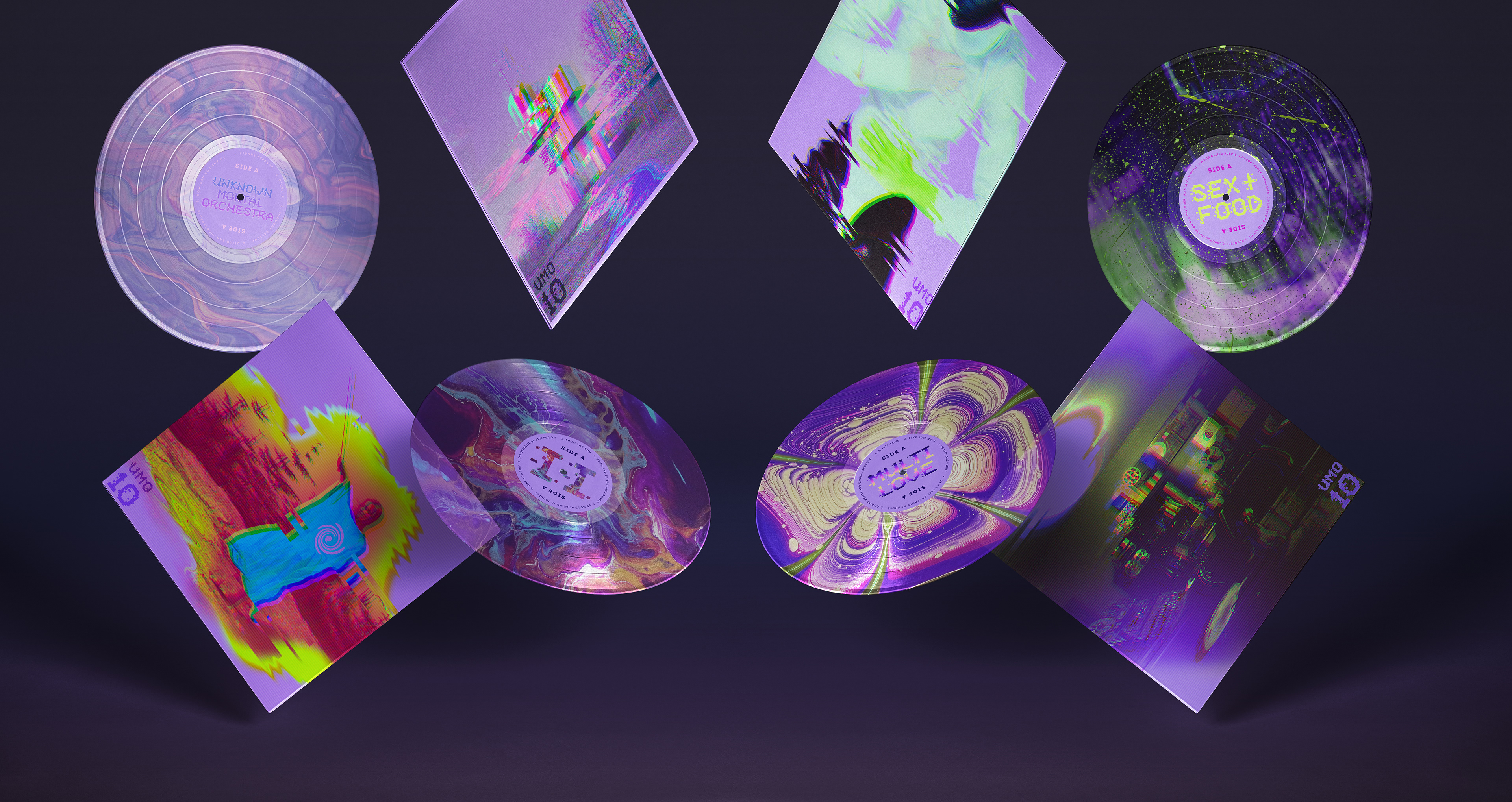
Vinyl Design
Album Art Cover and Vinyl
Merch Design
T-Shirts (Front)
T-Shirts (Back)
Tote Bags